Blue and gold can make an ordinary listing look more expensive in photos. It can also make a room look staged to death if the proportions are off. That is why this pairing deserves a staging plan, not a mood board.
For agents, the value is practical. Blue brings structure, depth, and a sense of calm that reads well online. Gold adds warmth, light bounce, and a premium cue without forcing a seller into a major renovation. The combination works best when one color leads and the other supports. Once both start competing for attention, the room loses clarity fast.
That is the issue with generic design advice. It rarely answers the questions that matter during prep for market. What will hold up in wide-angle listing photos? What can a seller execute on a real timeline and budget? What helps a room feel custom without turning into a taste-specific gamble?
This guide stays focused on those decisions. Each idea is filtered through staging use, buyer perception, cost control, and photo performance. Where it makes sense, agents can also pair these concepts with a practical virtual staging guide for real estate listings to test blue and gold options before spending on labor, materials, or accessories.
Blue and gold carries a built-in luxury signal, but the payoff depends on restraint. In an entry-level condo, that may mean navy pillows, a brass-framed mirror, and cleaner styling. In a higher-end home, it may support richer paint, custom upholstery, or statement lighting. Same palette, different execution.
Used well, blue and gold helps buyers remember the home. Used poorly, it reads like a theme. The sections below show how to use the palette room by room so it improves marketing, supports the price point, and gives your listing stronger visual identity from the first thumbnail onward.
1. Accent Walls with Gold Leaf Finish
A blue accent wall can rescue a flat room fast. It gives the eye a place to land, creates contrast behind neutral seating, and helps listing photos look intentional instead of vacant. Add restrained gold detailing, and the wall starts reading like a custom finish instead of a basic paint choice.
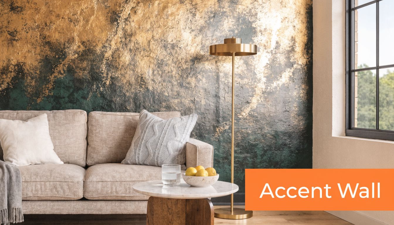
This works best in living rooms, primary bedrooms, and dining spaces with decent natural light. In a Miami condo, a deep blue wall with brushed gold striping can make a standard open-plan living area feel more architectural. In a Brooklyn townhouse, the same move often works behind a fireplace or dining banquette because it gives older rooms a cleaner focal point.
What works and what fails
Keep the furniture quiet. Cream, taupe, camel, ivory, and light wood let the wall do the work. If you stack blue sofa, blue wall, and gold coffee table in the same sightline, the room starts competing with itself.
Gold leaf can look excellent in person and terrible in photos if the finish is too patchy or too reflective. In staging, I’d choose subtle metallic paint, a brushed stencil treatment, or narrow gold banding before I’d choose heavy foil texture unless the home is firmly in the luxury tier.
Practical rule: Put this treatment only on the wall buyers would naturally face when entering the room.
Use AI before any paint goes on the wall. A fast mockup through Bounti’s virtual staging guide helps sellers see whether navy, slate blue, or a softer dusty blue suits the architecture. That’s especially useful when the seller wants drama but the room can only handle a controlled version of it.
A few execution details matter:
- Test under daylight and lamp light: Gold can flip from elegant to yellow fast.
- Choose crisp edges: Messy cut lines kill the custom look.
- Photograph both wide and detail shots: Buyers need the room view first, then the finish detail.
Later in the media package, video can show the reflective quality better than stills alone.
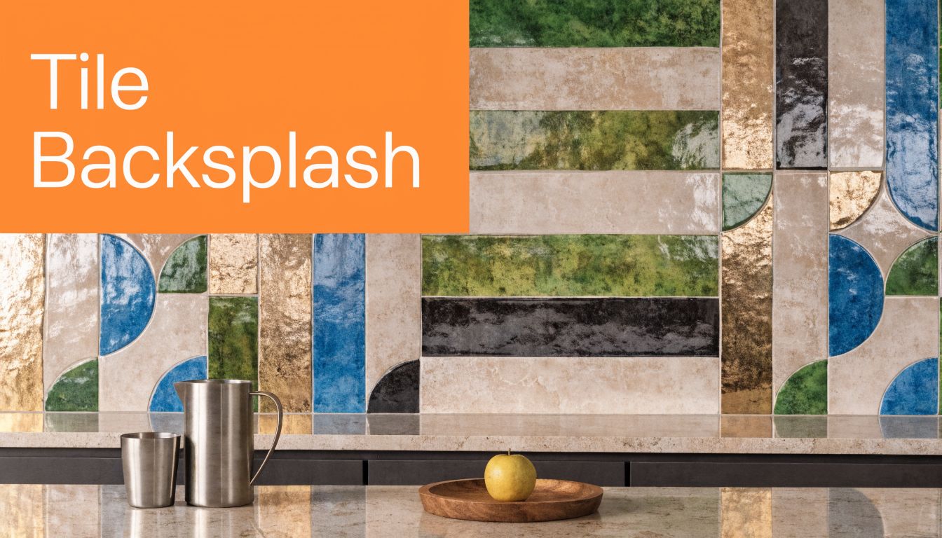
2. Blue and Gold Geometric Tile Backsplashes
Kitchens earn attention, but they also expose bad decisions immediately. Blue and gold decor in a backsplash works when the pattern feels architectural and disciplined. It fails when the tile is too busy, too shiny, or too specific to one taste profile.
A geometric backsplash is strongest in homes that already support detail. Think Mediterranean houses in coastal California, updated Texas farmhouses with warm wood, or Denver condos that need one premium element to separate them from the unit next door. In those settings, blue tile with restrained gold accents can make stock cabinetry look more custom.
Keep the pattern timeless
Moroccan-inspired forms, clean hex layouts, and repeated linear geometry usually hold up well in photos. Novelty patterns don’t. If the seller is leaning toward something highly ornate, pull them back unless the home itself is highly ornate.
The grout matters more than most agents think. Dirty grout, uneven spacing, and sloppy edge trim can cancel out the entire luxury effect. Before photography, make sure the surface is spotless, reflective metals are fingerprint-free, and under-cabinet lighting doesn’t create hot spots on the glaze.
Buyers won’t remember the grout color. They will remember whether the kitchen looked expensive or fussy.
Use the backsplash to support the room, not dominate it. Stainless steel appliances usually keep the look current. Brass or gold cabinet pulls can work, but only if the finish matches the tile accents closely enough to look deliberate.
For MLS photos, I’d capture one straight-on composition that shows the backsplash in relation to the counters, then one tighter shot near the range or sink. That second image helps buyers register finish quality, which is important in kitchens where every listing starts to look the same at thumbnail size.
3. Gold-Trimmed Blue Velvet Upholstered Furniture
Not every property needs statement furniture. But when a room feels cold, underscaled, or visually forgettable, blue velvet with gold trim can fix the problem fast. It gives softness, depth, and a luxury cue in one move.
This is especially effective in luxury apartment staging where the architecture is clean but generic. A blue velvet accent chair with a slim gold frame can make a Manhattan living room photo feel finished. In a Miami high-rise, a pair of blue stools with brass caps can sharpen an otherwise bland corner without blocking views.
Use one hero piece, not a matching set
Agents often overdo this look by renting a full blue velvet seating group. That’s usually a mistake. One sofa, one bench, or two accent chairs are enough. The room still needs breathing space.
Good versions of this idea have controlled silhouettes. Think channel-back chairs, tight-seat sofas, clean ottomans, and slim metal details. Puffy arms, ornate tufting, and shiny faux gold frames push the room toward hotel-lobby staging, which buyers often read as impersonal.
A few placement rules keep it working:
- Face the architecture: Aim seating toward windows, fireplaces, or a view line.
- Protect circulation: Don’t let a statement chair choke a walkway just because it looks good in one angle.
- Keep textiles crisp: Velvet shows crushing, dust, and wear quickly under flash and daylight.
If the seller already owns a blue piece, evaluate it brutally. If it’s worn, faded, or bulky, remove it. The idea is premium contrast, not sentimental furniture retention.
I’d also pair these pieces with quieter supporting materials. A cream rug, stone side table, and a small brass lamp usually photograph better than piling on more saturated accessories. Blue and gold decor works in staging when it feels edited. Once every object starts echoing the same palette, the room stops looking aspirational and starts looking staged in the worst sense.
4. Blue and Gold Chandelier and Lighting Fixtures
Lighting earns its keep twice. It changes the room in person, and it changes how every finish reads on camera. If a property has one weak builder-grade fixture in the dining room or foyer, upgrading that piece can do more than adding another round of accessories.
The White House Blue Room shows why this palette endures. During the Truman renovation, designers used deep blue silk walls with gold urn and flower patterns, a blue silk taffeta valance with black and gold trim, gold-and-white dado rails, and an early 19th-century Savonnerie carpet in blue, gold, and pink, as detailed in the history of the Blue Room). That layering matters for agents because it shows the palette works best when light catches gold details against a controlled blue field.
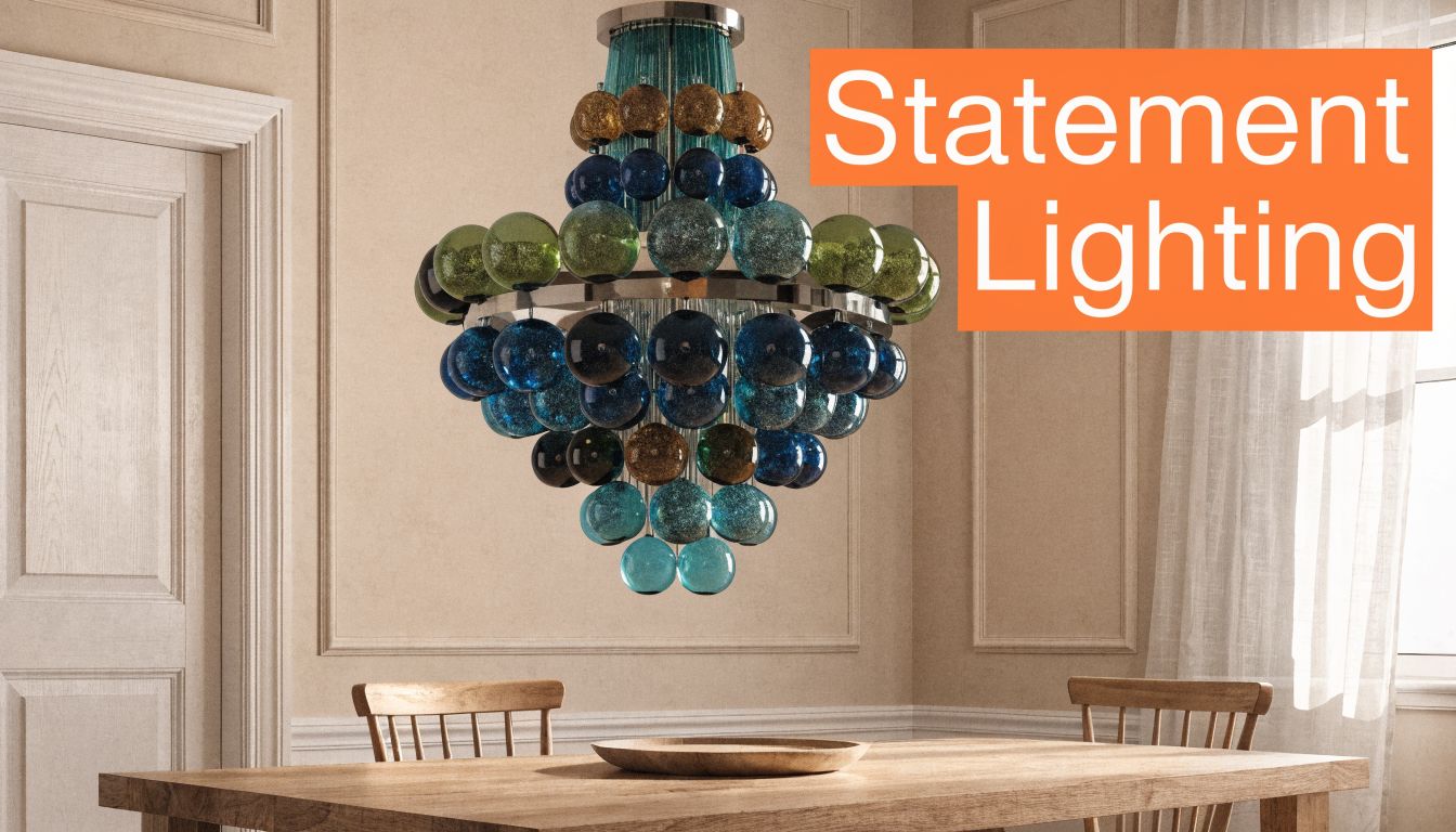
Where fixtures pull the most weight
Dining rooms and entryways are the obvious wins, but don’t ignore breakfast nooks, stair landings, and powder rooms. A blue glass pendant with warm brass hardware can turn a forgettable niche into a photo asset. In suburban transitional homes, that often creates the “custom” impression buyers want even when the footprint is standard.
Fixture scale matters more than style labels. Too small, and the room still looks cheap. Too large, and the fixture becomes the only thing a buyer sees.
For photography, I’d shoot the fixture illuminated and unlit. The illuminated set shows mood. The unlit set often gives cleaner glass and metal detail. If you’re refining the final image package, tools discussed in Bounti’s guide to the best AI photo editing software can help clean glare, balance warmth, and keep brass finishes from skewing too orange.
The best light fixture in a listing doesn’t scream for attention. It quietly raises the perceived quality of everything around it.
5. Blue and Gold Patterned Wallpaper and Wall Coverings
Wallpaper is one of the fastest ways to make a small room memorable. That’s why I like blue and gold decor most in powder rooms, guest bedrooms, and compact foyers where buyers can absorb the full effect in one glance.
Peel-and-stick options have made this easier for occupied listings and upscale rentals. But easy install doesn’t mean low risk. If the pattern is trendy, oversized, or badly aligned at seams, buyers notice the execution before they appreciate the design.
Best rooms for pattern
Powder rooms are the safest place to take a bigger swing. They’re small, self-contained, and naturally suited to richer finishes. A blue-and-gold floral, linear, or soft damask can feel upscale there even if the rest of the house stays restrained.
Primary bedrooms need more caution. The wall covering should support rest, not stage a spectacle. In that room, I’d lean toward quieter geometry, subtle metallic detail, or a textured grasscloth look rather than a loud motif.
A few decisions separate smart wallpaper staging from expensive clutter:
- Choose patterns with rhythm: Repetition photographs better than chaotic variation.
- Prep the wall first: Every bump and old patch line will show.
- Watch sheen levels: High shine can create camera glare and expose seams.
This is also a strong use case for AI visualization before purchase. If the seller is torn between a warm navy pattern and a lighter slate-blue paper, preview both and compare them in the actual room shape. That keeps everyone from making a style decision based on a 6-inch sample that won’t read the same way across a full wall.
I’d avoid wallpapering every major room in the same property. One memorable application sells discernment. Repetition starts feeling like a theme package.
6. Blue and Gold Decorative Accessories and Styling
This is the easiest entry point, and it’s the one most agents misuse. Accessories can sharpen a listing quickly, but only if they edit the room instead of filling it. Blue and gold decor should look placed, not sprinkled around.
The reason this category matters is simple. Color influences buying decisions quickly, and that effect doesn’t require a renovation to activate. If your listing already has solid bones, a tighter accessory plan can push the photos from clean to compelling.
Build one visible story per room
In a living room, that may be blue pillows, one brass tray, a ceramic vase, and art with blue movement. In a bedroom, it might be a navy lumbar pillow, soft gold bedside lamps, and one framed print with muted tones. In a bathroom, it can be as little as folded blue hand towels and brushed brass accessories if the hard finishes already carry the space.
Don’t distribute the same exact shade everywhere. The room needs variation in material and tone. Navy velvet, slate ceramic, antique brass, and pale blue glass work together because they don’t flatten into one note.
A simple formula helps:
- Keep the base neutral: Let walls, rugs, and large upholstery stay quiet.
- Use blue for soft goods: Pillows, throws, ceramics, and art carry it well.
- Use gold in smaller reflective moments: Frames, lamps, trays, and hardware usually do enough.
Because buyers make snap judgments based on color, detail styling shots matter here. A shelf vignette, a styled console, or a bedside composition can add polish to a listing package even if those images aren’t the lead MLS photo. They help on property sites, social clips, and email marketing where buyers consume homes in smaller visual fragments.
Restraint sells this look better than abundance.
7. Blue and Gold Area Rugs and Layered Rug Styling
Rugs solve three staging problems at once. They define the furniture plan, soften acoustically cold rooms, and add pattern without touching walls or millwork. In blue and gold decor, they’re often the cleanest way to introduce the palette in homes where permanent changes aren’t practical.
A strong rug can anchor a living room in a luxury rental, sharpen a condo with gray flooring, or give a large bedroom enough warmth to feel livable in photos. Layering can work too, but only when it clarifies the room rather than showing off a styling trick.
Layer for scale, not for novelty
The best layered look usually starts with a larger natural-fiber base, then adds a blue-and-gold patterned rug on top. That second rug should define the conversation area or bed zone clearly. If both rugs are patterned, the room often loses visual order.
Traditional homes can carry Persian or Turkish-inspired blue rugs with muted gold notes. Contemporary properties usually need cleaner geometry or low-contrast abstract patterning. Match the rug language to the architecture. That sounds obvious, but it’s where a lot of staging packages go wrong.
A few practical notes matter in photos:
- Float front legs consistently: Crooked placement reads instantly as amateur.
- Steam or flatten edges: Curled corners kill the luxury signal.
- Shoot one angle high enough to show the rug shape: Otherwise buyers miss the value of the piece.
This category is especially useful when a room needs color but the seller won’t repaint and won’t rent furniture. A high-quality rug can still create a focal zone, give blue and gold decor credibility, and help the room feel furnished at the right scale. It’s not the cheapest item in the staging budget, but it often earns more than another set of generic accessories would.
8. Blue and Gold Kitchen and Dining Room Design
Kitchens and dining rooms close the value story fast. If blue and gold decor looks built in rather than styled in, buyers read the home as more finished, more expensive, and more ready for entertaining.
For staging, this room pair needs discipline. Blue cabinetry, a navy island, or even a restrained set of blue counter stools can carry the color. Gold should support the architecture through hardware, faucets, pendants, or a simple dining fixture. Once both colors start competing across every surface, the room slips from polished to themed, and that costs you in photos.
Put money into permanent-looking changes
If the seller has budget for one meaningful update, start with hardware. Brass or brushed gold pulls on blue cabinetry usually photograph better than a table full of accessories, and buyers treat that change as part of the house rather than temporary styling. If cabinets are dated but structurally fine, painting only the island blue is often the better trade-off than repainting the full kitchen. It gives the listing a focal point without shrinking the room.
Dining rooms need the same restraint. A clean table with blue ceramics, warm metal flatware, neutral linen, and one low centerpiece reads current. Four complete place settings are usually enough for listing photos. More than that starts to feel like event staging, which distracts from room size and layout.
The photo strategy matters here as much as the styling. Mixed light is hard on this palette. Gold turns harsh under warm bulbs, and blue cabinetry can go muddy if daylight is weak. I prefer one hero angle that shows the kitchen and dining relationship, then one tighter shot that captures hardware, lighting, and one styled dining moment. If you need seller approval before making changes, use a house staging before-and-after gallery to show how a small finish package can change the listing’s perceived price point.
For agents using AI visualization tools like Bounti, keep the prompt practical. Specify matte or satin blue cabinetry, brushed gold hardware, light counters, and minimal countertop objects. Ask for lived-in luxury, not editorial drama. That produces images sellers can approve and buyers can believe.
One caution. Do not let the kitchen absorb every blue and gold idea from the house.
If the bathroom already features brass fixtures and the seller is considering blue tiles for a bathroom, keep the kitchen version simpler so the finishes feel coordinated instead of repetitive. The strongest listings repeat the palette, but each room should express it differently.
This approach performs especially well in homes where entertaining is part of the buyer profile. Urban condos with open plans, suburban homes with updated kitchens, and traditional dining rooms that need a fresher identity all benefit. The goal is clear. Buyers should see where people gather, how the room works, and why the home feels worth the asking price.
9. Blue and Gold Bathroom Spa Design and Styling
Bathrooms sell emotion. If the room feels clean, bright, and luxurious, buyers assign more value to it than the square footage alone deserves. Blue and gold decor is strong here because it can create a spa cue without requiring an all-marble renovation.
Blue tile on a feature wall, brass-toned fixtures, a framed mirror, and crisp white towels usually do enough. Full blue tile coverage can work in luxury homes, but in most listings it’s smarter to concentrate the color in one zone and let the rest of the bathroom stay light.
Prioritize hard finishes before soft styling
If the faucet is dated, the lighting is poor, and the mirror is builder-basic, adding candles and rolled towels won’t save the room. Fix the hard visual liabilities first. Then add the styling.
This is one place where before-and-after visualization can help sellers approve an upgrade path quickly. Showing a mocked-up vanity wall with blue tile, warmer metal, and cleaner lighting often gets faster buy-in than describing it. That’s why I like using examples similar to those in Bounti’s house staging before-and-after gallery when talking through options.
A few high-return moves:
- Upgrade the mirror: A gold-framed mirror often changes the whole vanity wall.
- Limit accessory count: One tray, one hand towel set, one soap vessel is enough.
- Shoot close details: Hardware and tile texture deserve at least one tight image.
If you’re looking at actual finish inspiration, blue tiles for a bathroom can help sellers understand the range from soft coastal tones to deeper saturated looks. For staging, I’d stay on the more timeless end. Bathrooms age visually faster than living rooms, and a trendy tile choice can date the listing package just as quickly as it can dress it up.
10. Blue and Gold Entryway and Foyer Statement Design
If the entry falls flat, the rest of the house starts from behind. Buyers form a read on quality almost immediately, and the foyer is where that judgment often locks in. Blue and gold decor is especially useful here because it can create drama in a small footprint.
A blue wall, gold-framed mirror, narrow console, and one sculptural light fixture can transform an ordinary foyer. In a double-height suburban entry, that may mean wallpaper above the wainscot and a brass lantern. In a downtown condo, it may only mean a strong art piece, a smoked-blue lamp, and a brushed gold mirror over a slim table.
Make the first photo count
The foyer should be camera-ready from multiple angles, but one composition matters most. Buyers need a first image that feels open, bright, and purposeful. If the entry is dark, use the mirror to bounce light and trim unnecessary furniture before adding any decorative object.
Scale is where this area usually goes wrong. Tiny consoles disappear. Oversized benches choke circulation. Excess décor near the front door makes the home feel smaller before the tour has even started.
I’d keep the styling disciplined:
- Anchor with one strong reflective element: Usually a mirror.
- Use vertical light: Sconces or a pendant make the space feel finished.
- Limit tabletop styling: A bowl, a book stack, and one vase are enough.
Blue and gold decor in the foyer should set a tone, not tell the whole story. If the entry announces sophistication and the rest of the home follows through with quieter echoes of the palette, the listing feels cohesive. If the foyer is dramatic and every later room repeats the exact move, the effect wears out quickly.
Blue and Gold Decor: 10-Point Comparison
| Item | Implementation Complexity 🔄 | Resources & Speed ⚡ | Expected Outcomes ⭐ / 📊 | Ideal Use Cases | Key Advantages 💡 |
|---|---|---|---|---|---|
| Accent Walls with Gold Leaf Finish | Medium–High, professional application recommended | Moderate cost, quick install (days), lighting-sensitive finish | ⭐⭐⭐⭐, Perceived luxury +10–15% (buyer surveys) 📊 | High-end living rooms, dining rooms, photo-focused listings | Instant focal point; highly photogenic; reversible |
| Blue and Gold Geometric Tile Backsplashes | High, skilled tiler and precise installation | High upfront cost ($1,500–$5,000+), 1–2 week disruption | ⭐⭐⭐⭐, Strong kitchen appeal, durable aesthetic 📊 | Kitchens and baths in Mediterranean/modern homes | Durable + functional; long-lasting visual impact |
| Gold-Trimmed Blue Velvet Upholstered Furniture | Low–Medium, purchase and professional staging advised | Higher item cost ($1,200–$4,000+), rental staging available (monthly) ⚡ fast to place | ⭐⭐⭐⭐, Instant luxury ambiance; excellent photo performance 📊 | Luxury apartments, living rooms, staged rentals | High visual impact; reversible rental/staging option |
| Blue and Gold Chandelier and Lighting Fixtures | Medium, electrical work by licensed electrician | Fixture cost $500–$2,500+, labor $200–$500; relatively quick install | ⭐⭐⭐⭐, Transforms ambiance; highly visible in photos 📊 | Entryways, dining rooms, living spaces | Sculptural focal piece; improves photography and mood |
| Blue and Gold Patterned Wallpaper & Wall Coverings | Low–Medium, peel-and-stick easy; pro install reduces seams | Low cost ($50–$300), very quick to apply; removable options | ⭐⭐⭐, Dramatic look at low cost; trend risk 📊 | Accent walls, powder rooms, renter-friendly spaces | Affordable, non-permanent, flexible for quick restyles |
| Blue and Gold Decorative Accessories & Styling | Low, simple styling and placement | Lowest cost ($300–$1,000), fastest to implement ⚡ | ⭐⭐⭐, High visual ROI; flexible and repeatable 📊 | Whole-home staging, last-minute photo shoots | Most affordable; quickest visual uplift; easy swap-outs |
| Blue and Gold Area Rugs & Layered Rug Styling | Low–Medium, placement and layering technique | Moderate cost ($300–$1,500), heavy to move, quick staging | ⭐⭐⭐⭐, Defines space; major photographic impact 📊 | Living rooms, seating areas, rental show homes | Defines zones; versatile styling; strong texture/photography gains |
| Blue and Gold Kitchen & Dining Room Design | High, coordinated cabinetry, hardware, styling | Very high cost ($5,000–$15,000 for refacing), multi-week timeline | ⭐⭐⭐⭐⭐, Showroom-quality transformation; high buyer draw 📊 | Entertainer-focused luxury homes, high-end listings | Cohesive, high-impact transformation; marketing standout |
| Blue and Gold Bathroom Spa Design & Styling | Medium–High, tile and fixture upgrades often required | Moderate–High cost ($1,500–$5,000), 2–4 week timeline | ⭐⭐⭐⭐, Strong emotional appeal; influences offers 📊 | Master baths, condo bathrooms, spa-inspired listings | Contained project with high perceived luxury and wellness appeal |
| Blue and Gold Entryway & Foyer Statement Design | Low–Medium, focused styling and possible accent wall | Moderate cost, quick to stage, requires durable accessories | ⭐⭐⭐⭐, High first-impression uplift; increases interest 📊 | Foyers, main entrances, homes with memorable entries | Immediate curb-to-interior narrative; sets tone for tours |
From Vision to Listing Your Blue and Gold Staging Plan
Blue and gold staging can make an average listing look more expensive in photos without forcing a full remodel. That is why it works so well for agents. The palette gives you enough character to stand out in a crowded MLS feed, but it still reads broad-market when you control the ratio and keep the styling tight.
The mistake is treating blue and gold like a decorating theme instead of a sales tool. In staging, every choice has to earn its place. A navy velvet chair might add depth in a luxury condo with strong natural light, but the same piece can feel heavy in a small suburban living room with beige carpet and low ceilings. Gold finishes can sharpen a kitchen or bath on camera, yet too much reflective metal creates glare and visual noise in listing photos.
Start with the rooms that carry the listing. For most homes, that means the entry, main living area, kitchen, and primary bath. Those spaces set buyer expectations early, show up repeatedly in the photo set, and do the most work during showings.
Budget should decide the method, not the goal. Lower-budget listings usually get the best return from accessories, pillows, art, lamps, and a single rug that ties the palette together. Higher-end listings can support wallpaper, reworked lighting, painted millwork, or a more curated furniture package. The point is not to spread blue and gold everywhere. The point is to create a controlled visual thread buyers remember.
Good staging plans also account for how the home will be marketed, not just how it will look in person. Blue often reads darker on camera than it does during a walkthrough, especially in rooms with mixed lighting. Gold can shift brassy if bulbs are too warm or if the finish is overly polished. Test the scheme in photos before installation is final. Agents who skip that step often end up restyling the room after the shoot, which costs time and money.
Bounti helps tighten that workflow. You can show sellers multiple blue and gold staging directions on the same room before ordering inventory or scheduling installers. That makes approval faster and helps you choose a version that fits the home’s architecture, lighting, and likely buyer profile. It also gives you polished visual options for pre-listing conversations, marketing prep, and pricing strategy.
A practical rollout usually looks like this:
- Pick one lead space: Start with the room that will sell the listing in photos.
- Set the color ratio early: Let blue carry the visual weight and use gold as the accent, not the other way around.
- Adjust for price point: Higher-end homes can handle richer materials and deeper tones. Mid-market homes usually perform better with lighter, cleaner applications.
- Photograph test angles before finalizing: Confirm that the palette reads clearly on camera and does not overpower the room.
- Repeat selectively: Carry one or two elements into nearby spaces so the home feels consistent without looking staged to death.
Agents who use this palette well usually follow the same discipline. They keep the architecture in focus, edit aggressively, and spend where the buyer will notice it first. That is how blue and gold stops being a style preference and starts working as listing strategy.
Bounti Labs helps you turn ideas like these into listing-ready visuals fast. With Bounti Labs, you can use a single walkthrough to generate MLS-ready photos, create polished property descriptions, and test AI-powered staging, decluttering, restyling, or renovation concepts before spending time on manual vendors. If you want blue and gold decor options that sellers can approve quickly and buyers can respond to immediately, Bounti gives you the speed and flexibility to make that happen.