Yellow and blue bedroom staging isn’t just a safe design move. It’s a traffic and conversion move when you use it with intent. Houzz reported more than 4,060 user-submitted yellow bedroom images as of April 2026, along with a 25% increase in yellow-themed bedroom searches since 2020, which tells you buyer attention is already there in the visual discovery phase of home shopping (Houzz yellow bedroom ideas).
For listing agents, that matters because buyers often decide whether a bedroom feels restful, current, or forgettable in a few seconds of scrolling. Yellow and blue can push a room in any of those directions depending on tone, contrast, and how much of each color you use. Done right, the palette reads calm, layered, and marketable. Done wrong, it reads childish, dark, or theme-heavy.
Most advice on bedroom decorating ideas yellow and blue stops at pillows, paint, and pattern mixing. That’s not enough for agents. You need schemes that fit the property type, attract the right buyer profile, and photograph cleanly for MLS, portals, and paid social. If you need broader foundational ideas before dialing into this palette, this ultimate guide to stunning bedroom decor is a useful companion read.
1. Coastal Modern Soft Yellow Accents with a Navy Blue Base
Navy is one of the easiest ways to make a bedroom look more intentional. Soft yellow is one of the easiest ways to keep navy from feeling severe. Together, they work especially well in coastal listings, modern farmhouses, and homes where the seller wants a polished room without turning it into a luxury showroom.
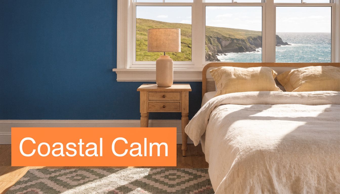
Use navy on the main wall, ideally the wall behind the bed. Then bring in buttery yellow through bedding, one throw pillow pair, and a single art piece. White trim, pale oak, and light upholstery keep the room from getting visually heavy.
What works in listings
This scheme is strongest in California, Florida, Gulf Coast, and lake-market properties, but it also works in suburban homes that need a more elevated primary bedroom. Buyers read navy as grounded and substantial. They read soft yellow as warm and approachable.
Dulux highlights blue and yellow as a strong primary color pairing in its design guidance, which lines up with what agents see in practice. Blue calms the room down, yellow stops it from feeling flat or cold.
Practical rule: If the room has limited natural light, keep yellow in the textiles and leave the larger furniture white, cream, or light wood.
Use removable layers first. Bedding, curtains, and artwork are easier to change than paint, and they give you more control over photos. If the seller is hesitant, mock up the look with AI before anyone opens a paint can. A staged visual sequence like these house staging before and after examples helps sellers understand how much one wall color can shift a room.
What doesn’t work
Avoid pairing navy walls with bright lemon bedding, dark wood furniture, and black lamps all at once. That combination often photographs muddy, not luxurious. Also skip obvious beach props. Rope mirrors, anchors, and shell décor can make the room feel like a short-term rental even when you’re selling a primary residence.
2. Scandinavian Minimalist Pale Blue Walls with Sunburst Yellow Accents
If the bedroom is small, cluttered, or architecturally plain, pale blue does more for you than saturated blue. It lifts the room without making it feel fragile. Then one controlled hit of yellow gives the eye somewhere to land.
This is the version of bedroom decorating ideas yellow and blue that works in city apartments, compact suburban bedrooms, and northern-climate homes where natural light runs cooler. Pale blue walls, white bedding, light wood, and one sunburst yellow accent keep the room airy and buyer-friendly.
Where this look earns attention
This style is ideal when you’re selling to buyers who want clean lines and low visual noise. Think first-time urban buyers, downsizers who don’t want fuss, or professionals shopping newer townhomes and condos.
The restraint is the point. One yellow chair, one framed abstract, or one modern pendant is enough. More than that, and the room starts reading staged in the wrong way.
- Keep the floor palette light: Pale oak, ash, or warm neutral rugs support the blue without making it cold.
- Use yellow once with intention: A single statement accent beats five small yellow accessories every time.
- Photograph at the brightest point of day: Pale blue can skew gray if the room is shot too early or too late.
Trade-offs to manage
Minimal rooms expose every mistake. If the bedding is wrinkled, if cords show, or if furniture is underscaled, buyers see it immediately. This is also one of the easiest looks to get wrong with the wrong yellow. Neon or acidic yellow tends to feel juvenile against pale blue.
Bounti’s AI decluttering and restyling tools are useful here because this style depends on editing. You’re not trying to impress buyers with more stuff. You’re trying to show clarity, order, and breathing room.
Less décor usually means better listing photos, but only if the remaining pieces look deliberate.
3. Tropical Paradise Vibrant Blue Accent Wall with Golden Yellow Furnishings
A tropical version of yellow and blue should feel like a getaway, not a theme room. That distinction matters. One turquoise or ocean-blue accent wall paired with golden yellow textiles can create strong emotional pull in vacation markets, resort communities, and second-home listings.
This approach works best when the property already supports the story. Ocean views, pool access, palm landscaping, or indoor-outdoor architecture make the palette feel natural. In an inland tract home, the same room can feel forced.
Best fit for second-home and resort inventory
Use the strongest blue on a single wall only. Then layer warm yellow through a throw, bench cushion, accent pillows, or a woven upholstered chair. Add natural textures like rattan, cane, jute, and light wood to keep the room grounded.
When the architecture supports it, this style helps buyers imagine lifestyle first and square footage second. That’s especially useful in homes where the bedroom itself isn’t oversized but the setting is a major selling point.
For agents handling vacation inventory, virtual experimentation pays off because the line between “aspirational” and “too much” is thin. Bounti’s virtual staging guide for real estate listings is useful for testing which wall should carry the stronger blue and how much yellow the room can absorb before the look tips into novelty.
What to keep under control
A tropical room falls apart fast when every surface competes. Don’t add palm prints, bright artwork, bold bedding, and oversized yellow furniture in one pass. Pick one hero move. Usually that’s the wall.
Also watch the undertones. Teal-blue and golden yellow work. Cobalt and pale butter can clash in this style. White bedding is the reset button that keeps the palette feeling hotel-clean rather than busy.
4. Traditional Elegance Rich Navy with Pale Butter Yellow Accents
Some listings need reassurance more than novelty. Historic homes, Colonial properties, and established luxury neighborhoods often respond better to a classic yellow and blue palette than a trendy one. Rich navy with pale butter yellow feels settled, polished, and expensive without trying too hard.
In these homes, the bedroom decorating ideas yellow and blue should support architectural details already in the room. Crown molding, paneled walls, fireplaces, taller windows, and antique furniture all benefit from a quieter, more refined treatment.
Where this look sells best
This is a strong match for New England Colonials, Mid-Atlantic traditional homes, and older houses where buyers expect formality. Use navy on the wall or upholstered headboard. Bring pale yellow through drapery, lumbar pillows, a bench seat, or muted botanical art.
According to the verified trend summary, yellow and blue combinations have roots in 18th-century French country interiors and saw a revival in 2023 Grandmillennial styling. That’s useful context for listings with antiques or vintage pieces because the palette can make older furniture look curated instead of dated.
In traditional homes, buyers respond better to softened yellow than bright yellow. Butter reads elegant. Lemon often reads decorative.
Common mistakes in classic homes
Don’t mix too many periods. A navy wall, butter yellow drapery, Louis-style nightstands, black industrial sconces, and abstract street art all in one room creates tension that doesn’t help the sale. In traditional inventory, consistency usually beats edge.
Lighting also matters more here than agents think. Navy absorbs light. If the room has one overhead fixture and weak window exposure, add table lamps or virtually stage them in. Traditional rooms need visible light sources to feel livable in photos.
5. Modern Eclectic Soft Blue-Gray with Mustard Yellow Statement Pieces
This is the most marketable version for design-aware younger buyers. Soft blue-gray on the walls creates a calm base. Mustard yellow adds enough personality to make the room memorable in a scroll without pushing into niche taste.
It works especially well in lofts, renovated condos, and neighborhoods where buyers expect some style confidence. If you’re marketing to millennial buyers, this direction lines up with the verified trend note that Grandmillennial-influenced styling with yellow and blue has appealed strongly to that segment.
The right way to use mustard
Mustard should show up in two or three pieces, not ten. A bench, accent chair, or patterned throw is enough. Add black or brass hardware and lighting to sharpen the room, then let soft textiles keep it comfortable.
This palette is also one of the best candidates for AI testing because mustard shifts dramatically depending on the blue-gray underneath it. What looks rich in person can look dull in a listing photo. That’s why many agents benefit from testing furniture placement and color intensity with tools like Bounti and reviewing options against the final image set with AI photo editing software for real estate marketing.
What buyers like and what they don’t
Younger buyers usually respond to a room that feels edited, current, and personal without looking chaotic. This look gets you there if the shapes are clean and the accessories stay limited.
- Choose one dominant mood: Go either soft contemporary or urban eclectic. Don’t split the room down the middle.
- Use mustard as punctuation: A single large accent reads stronger than scattered yellow décor.
- Ground the palette with texture: Bouclé, linen, walnut, and matte black help the room feel intentional.
What doesn’t work is mixing mustard with every trending move at once. Curvy furniture, checkerboard rugs, oversized gallery walls, and bold wallpaper can turn the room into a style collage. Buyers may admire it, but they won’t always picture themselves sleeping there.
6. Farmhouse Bright Soft Blue Shiplap with Cheerful Yellow Accents
Farmhouse staging still works when it feels restrained and local to the home. It stops working when it looks copied from a décor aisle. Soft blue shiplap, whether real or virtually visualized, gives a bedroom warmth and structure. Cheerful yellow accents bring the room out of beige territory.

This style belongs in cottages, rural homes, suburban family properties, and small-town listings where buyers want comfort more than polish. The best version looks simple and lightly collected. It doesn’t look branded.
How to keep farmhouse from getting cheesy
Use muted blue, not bright primary blue. Then bring in yellow through a quilt fold, lumbar pillow, vintage-style artwork, or a painted stool. White iron beds, pine furniture, woven baskets, and washed wood tones support the look.
The verified data notes that existing content in this category often misses the marketability angle for agents. That gap matters here. Farmhouse bedrooms aren’t just “cute.” In the right property, they can help buyers read the home as warm, family-ready, and emotionally accessible.
What to remove first
The first things I’d cut are word signs, excessive faux florals, and too many distressed finishes. Those details date a listing quickly. One old window frame or one antique crock is fine. Five nostalgia props in one bedroom usually aren’t.
Field note: Buyers forgive a simple room. They rarely forgive a room that feels over-themed.
If the seller likes farmhouse but the room is plain drywall, use AI to preview blue shiplap rather than suggesting immediate installation. It gives buyers a believable vision without creating cost or delay before launch.
7. Industrial Contemporary Slate Blue with Yellow-Gold Metallic Accents
Industrial bedrooms need warmth more than one might expect. Concrete tones, black frames, exposed brick, and warehouse windows can look impressive in person but cold in listing photos. Slate blue helps soften the shell. Yellow-gold metallic accents add the warmth buyers need to read the room as livable.
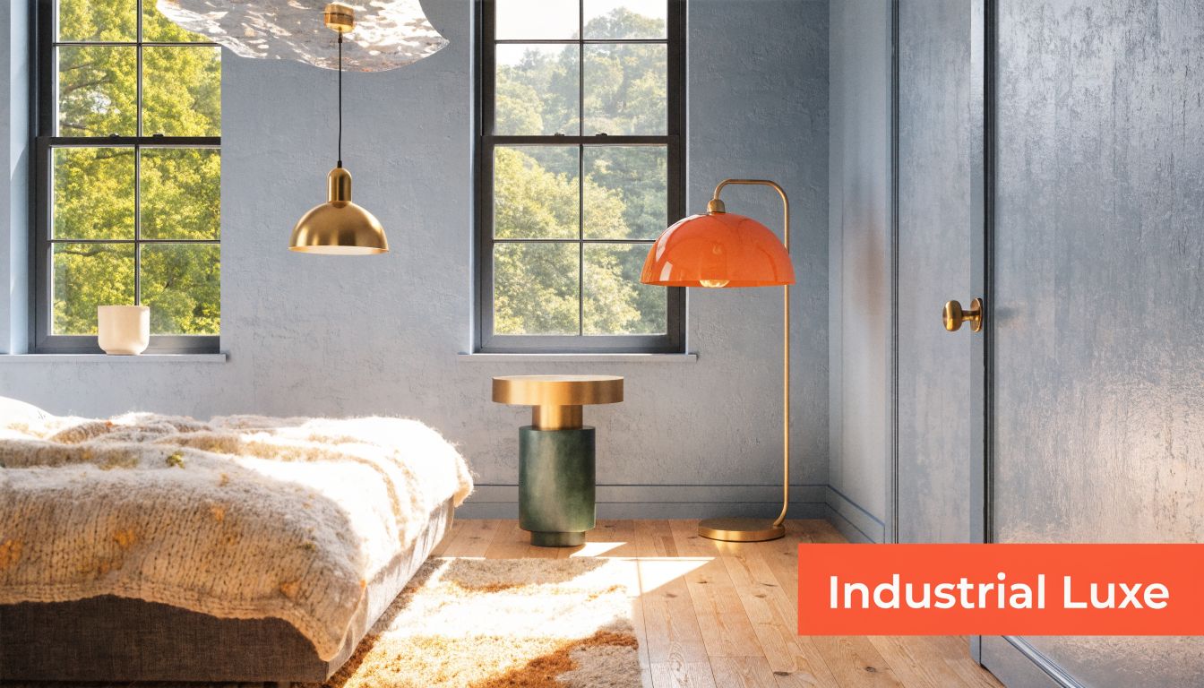
This is a smart move in converted warehouses, urban condos, and modern new-builds that have strong lines but weak softness. The wall color should stay muted. Think slate, gunmetal blue, or smoky blue. Then use warm brass or brushed gold in pendants, sconces, mirror frames, or bed hardware.
The luxury signal is in the finish quality
Cheap gold looks cheap in photos. Good brass looks deliberate. That’s the whole trade-off in this style. You don’t need many warm accents, but the ones you use need to look substantial.
The lighting temperature matters too. A slightly warmer bulb tone helps yellow-gold finishes read inviting rather than flashy. If you’re virtually staging an empty room, add only a few metallic elements and keep the furniture lean.
What to avoid in industrial listings
Don’t combine slate blue walls with lots of bright yellow fabric in this style. It fights the architecture. Use the yellow note through metal, art, or one upholstered accent only.
Also skip trying to “soften” an industrial room with farmhouse pieces. Reclaimed barn doors, tufted floral benches, and wire-frame pendants all in one room create stylistic confusion. Buyers may not have language for that problem, but they feel it immediately in the photos.
8. Soft Contemporary Powder Blue with Pale Lemon Yellow Layering
Powder blue and pale lemon are subtle enough for buyers who want color without commitment. In primary suites, especially in newer luxury suburban homes, this pairing can make the bedroom feel calm, current, and easy to live with.
This version works best when the room already has decent scale and good natural light. It’s less dramatic than navy and mustard, which means the textures have to do more work. Linen, wool, boucle, matte ceramic, and natural fiber shades keep the space from looking flat.
The appeal is broad, but the execution has to stay disciplined
Use powder blue on the walls or through the upholstered bed. Layer pale lemon through bedding trim, a folded throw, a lamp shade, or muted abstract art. Keep the yellow soft. The whole point is controlled warmth.
The verified market summary notes that agents have an opening to tie color choices to buyer demographics and visual conversion, especially as AI-powered restyling previews become more common in listing marketing. This palette is a good example. It’s easy to test, easy to tone up or down, and low-risk for broad buyer appeal.
The softest palettes are often the hardest to stage well because every texture choice carries more weight.
Where it underperforms
It won’t rescue a dark room with poor lighting. It also won’t create enough drama for highly competitive luxury listings that need a memorable visual hook. In those cases, powder blue can be too quiet unless the furniture, art, and architecture are doing serious work.
Still, for wellness-minded professionals and buyers who want a retreat rather than a statement, this is one of the safest and most adaptable yellow and blue bedroom directions you can use.
8-Style Yellow & Blue Bedroom Comparison
| Style | Implementation Complexity 🔄 | Resource Requirements ⚡ | Expected Outcomes 📊 | Ideal Use Cases | Key Advantages ⭐💡 |
|---|---|---|---|---|---|
| Coastal Modern: Soft Yellow Accents with a Navy Blue Base | Moderate, paint + lighting balance 🔄 | Low–Medium, accents, staging ⚡ | Serene, broadly marketable; ≈+8% value 📊 | Coastal & upscale suburban listings | Photogenic, versatile; easy, budget-friendly staging ⭐💡 |
| Scandinavian Minimalist: Pale Blue Walls with Sunburst Yellow Accents | Low–Moderate, declutter & one statement piece 🔄 | Low, minimal furniture, good light ⚡ | Airy, spacious feel; +15% appeal in urban centers 📊 | Urban apartments, lofts, design-conscious buyers | Clean photos, timeless minimalism; low-cost impact ⭐💡 |
| Tropical Paradise: Vibrant Blue Accent Wall with Golden Yellow Furnishings | Moderate, accent wall + tropical decor 🔄 | Medium, bold textiles, plants, textures ⚡ | High emotional impact; +25% in vacation markets 📊 | Beachfront, vacation rentals, resort-style homes | Memorable visuals, strong buyer connection; standout marketing ⭐💡 |
| Traditional Elegance: Rich Navy with Pale Butter Yellow Accents | High, quality furnishings & layered lighting 🔄 | High, premium fabrics, fixtures ⚡ | Timeless sophistication; +10–15% perceived value 📊 | Colonial/historic homes, luxury neighborhoods | Broad appeal, elevates perceived value; enduring style ⭐💡 |
| Modern Eclectic: Soft Blue-Gray with Mustard Yellow Statement Pieces | High, curated mix, styling skill 🔄 | Medium, statement furniture & art ⚡ | Distinctive listings; +20% interest among younger buyers 📊 | Urban lofts, hip neighborhoods, contemporary condos | Standout personality, flexible removable accents ⭐💡 |
| Farmhouse Bright: Soft Blue Shiplap with Cheerful Yellow Accents | High, shiplap install or convincing virtual restyle 🔄 | Medium–High, reclaimed wood, vintage pieces ⚡ | Warm, cozy appeal; +20–25% in rural/suburban markets 📊 | Cottages, farmhouses, suburban homes | Comfortable, authentic feeling; strong local appeal ⭐💡 |
| Industrial Contemporary: Slate Blue with Yellow-Gold Metallic Accents | High, integrate industrial elements & finishes 🔄 | Medium–High, quality metals, lighting ⚡ | Sophisticated urban appeal; +12–18% value perception 📊 | Lofts, modern condos, downtown developments | Luxury metallic highlights; gallery-like photography ⭐💡 |
| Soft Contemporary: Powder Blue with Pale Lemon Yellow Layering | Low–Moderate, texture & layered lighting 🔄 | Low–Medium, quality textiles, lighting ⚡ | Calming, widely appealing; boosts perceived tranquility 📊 | Primary suites, luxury suburban & wellness-focused homes | Spa-like serenity, broadly appealing and forgiving ⭐💡 |
From Idea to Offer Your Next Steps
The strongest yellow and blue bedroom isn’t the prettiest one in isolation. It’s the one that fits the property, the buyer profile, and the photo set you need to publish. A navy-and-butter room can anchor a historic listing. A powder blue and lemon room can calm down a modern suburban primary suite. A slate-blue industrial room can make a cold loft feel more expensive and more livable.
That’s the useful shift for agents. Stop treating color as decoration and start treating it as positioning. Bedroom decorating ideas yellow and blue work because they let you control emotional tone fast. You can make a room feel coastal, classic, youthful, grounded, or soft contemporary without changing the floorplan or spending weeks on a remodel.
The trade-offs are real. Too much yellow and the room gets loud. Too much dark blue and it gets heavy. The wrong undertones make the room look accidental. Over-theme the space and buyers admire it without identifying with it. Under-stage it and the room disappears in the listing feed.
That’s why fast testing matters. Before you commit to physical staging, paint, or new textiles, generate a few viable versions and compare them against the audience you’re targeting. If the listing is in a beach market, test coastal modern against tropical. If it’s a city condo, compare Scandinavian minimal against modern eclectic. If it’s a traditional family home, see whether farmhouse bright or traditional elegance reads better on camera.
The practical advantage of AI is speed and range. Instead of making one staging decision and hoping it lands, you can create multiple polished options from a single room capture, declutter distracting elements, restyle the same bedroom for different buyer segments, and choose the version that best supports the listing strategy. That’s especially useful for teams managing different property types or trying to win sellers who want to see the visual plan before approving updates.
Good staging doesn’t just help a bedroom look better. It helps the entire listing feel more coherent. When the bedroom aligns with the home’s architecture and the buyer’s expectations, the photos work harder. Buyers stay engaged longer. Sellers see the value more clearly. And the marketing story gets easier to tell across MLS, portals, social, and email.
If you want to turn yellow and blue bedroom concepts into MLS-ready visuals without waiting on manual staging vendors, try Bounti Labs. Bounti takes a single video walkthrough and turns it into listing descriptions, stills, AI decluttering, virtual staging, restyling, and renovation concepts fast, so you can test multiple looks, market to the right buyer, and launch stronger listing photos in less time.