
Beige isn't the backup choice anymore. In Country Living's 2025 ranking of popular bedroom colours, beige rose six places to become the No. 2 bedroom colour, while grey and white slipped. For agents, that matters because bedroom color isn't just decor. It's positioning.
A beige and grey bedroom works when it feels warm enough to photograph well, neutral enough to broaden buyer appeal, and finished enough to justify the asking price. It fails when it turns into a flat wash of mid-tone neutrals that reads tired, cold, or generic online. The difference usually comes down to staging discipline, not budget.
I treat this palette like a listing tool. Beige handles the emotional work. Grey provides structure and contrast. Then the marketing layer has to preserve that balance in photos, video, and MLS assets so the room buyers walk into matches the room they clicked on.
Why Beige and Grey Sells Properties in 2026
Beige is gaining ground with buyers, and that shift changes how I stage bedrooms for sale. Grey still has value, but it works better now as a supporting color than the main event.
That matters because the bedroom is one of the fastest rooms to trigger an emotional yes or no. Buyers may tolerate dated finishes in a guest bath or laundry area. A primary bedroom that reads cold, flat, or overly personal creates work in their mind, and work lowers offers.
For resale, beige and grey succeed because they solve two problems at once. In person, they make the room feel calm, finished, and easy to move into. Online, they give listing photos cleaner tonal separation between walls, bedding, flooring, and furniture, which helps the room read clearly on a phone screen. That second part matters more in 2026 than many agents admit. A bedroom now has to perform twice, first in the scroll and then at the showing.
I treat this palette as a staging system with a marketing workflow attached. The physical room has to feel warm without going yellow, and structured without going cold. Then the photo set, MLS images, and AI-edited visuals have to preserve those undertones so buyers see the same room across every touchpoint.
If paint, flooring, or trim condition is holding the room back, a practical resource like this Richmond home improvement guide helps agents prioritize updates that support resale instead of low-return cosmetic projects.
Why buyers respond to this palette
A well-staged beige and grey bedroom tends to move buyers in the right direction for a few practical reasons:
- It cuts perceived effort: Neutral walls and bedding reduce the buyer's mental to-do list.
- It broadens fit: The room can support modern, transitional, or traditional furniture without fighting any of them.
- It photographs cleanly: Soft beige keeps light bouncing, while grey adds edge definition that cameras need.
- It supports price perception: A bedroom that looks settled and current helps the whole home feel better maintained.
Buyers rarely comment on color theory. They comment on whether a room feels restful, expensive, and ready.
That is why before-and-after staging examples are useful in listing appointments. House staging before-and-after examples make the point clearly. Presentation changes buyer perception long before square footage or ceiling height does.
What sells, not just what looks good
The best beige and grey bedrooms are edited. Beige carries the visual weight. Grey defines shape, adds depth, and keeps the room from washing out in photos. Once both colors sit at the same intensity, the room starts to feel muddy and older than it is.
That trade-off shows up all the time in occupied listings. Sellers often own grey furniture, grey bedding, and grey curtains from the last cycle of updates. Replacing everything is rarely the highest-ROI move. I usually keep one or two grey anchors, then warm the room around them with beige bedding, softer wall color, ivory texture, and lighting that corrects the cast. The result is cheaper than a full redesign and more effective for buyer appeal.
Agents who stage this palette well are not decorating for compliments. They are removing friction, protecting photo performance, and giving AI-powered marketing assets a room that edits cleanly without looking fake.
Defining Your Palette's 80/20 Rule
If you want this palette to work consistently, use a simple rule: 80% warm beige, 20% contrast grey. That split keeps the room bright, warm, and broad-market, while still giving the eye enough contrast to see shape and finish.
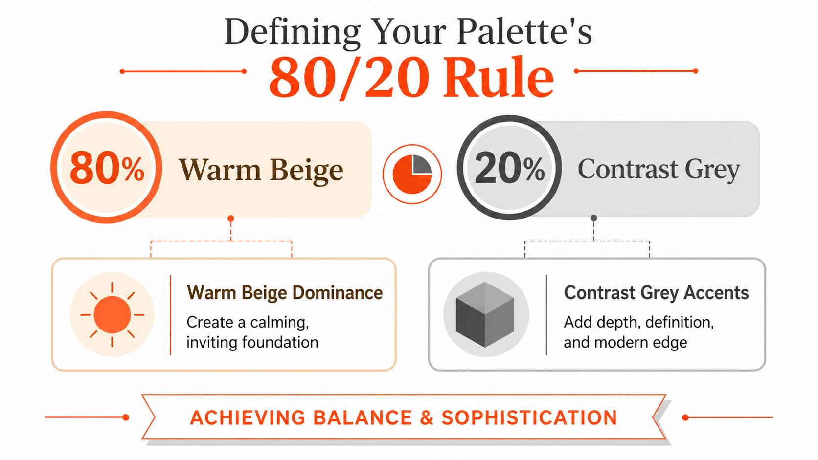
The technical basis is straightforward. Parachute's grey bedroom guidance recommends using the lighter, higher-lightness hue on the largest surfaces to visually expand the room, then adding one darker grey anchor such as a headboard wall, duvet, or curtains. That same guidance warns against overusing mid-value neutrals without texture, because the room starts to feel visually compressed instead of calm.
Where the 80 percent goes
The beige share belongs on the surfaces that define volume:
- Walls: Warm beige or soft greige keeps the perimeter open.
- Main bedding: Duvet cover, coverlet, or quilt should stay in the lighter family.
- Rug and drapery: These should support softness, not create heavy contrast.
- Large upholstered pieces: Bench, accent chair, or headboard if you're keeping the room very light.
Agents often make a common mistake: they pick a beige that looks neutral on a paint chip but goes flat or yellow under bedroom lighting. In staging, I'd rather use a beige with a muted, dusty warmth than anything that reads chalky or overly creamy.
If you need a seller-friendly way to talk through undertones before paint goes up, this Melbourne homeowners' colour guide is useful because it frames color choice around livability, not trend chasing.
Where the 20 percent goes
Grey should act like punctuation. It's there to define edges and give the room some discipline.
Use it in one or two places only:
- Anchor wall behind the bed if the room has enough natural light.
- Bedding contrast layer like a throw, shams, or folded blanket.
- Curtains or a bench if the walls and bed are already warm and light.
Practical rule: If the room feels small, put grey on movable items first. If it still feels shapeless, add one fixed grey element.
What doesn't work
Here's the version that kills a listing photo:
| Choice | Result |
|---|---|
| Beige walls + beige bedding + beige drapes + grey carpet | No visual hierarchy |
| Equal amounts of beige and grey | The room feels undecided |
| Mid-tone beige with mid-tone grey | Flat and compressed |
| Too many finishes | Busy, cheap, staged |
Limit the materials. Linen, wool, wood, and a restrained metallic finish are enough. Once you start stacking mirrored furniture, glossy synthetics, or multiple wood tones, the palette loses its authority.
A beige and grey bedroom should read intentional in three seconds. If it takes longer, the room is overworked.
Arranging Furniture for Flow and Photography
A staged bedroom isn't arranged for daily life. It's arranged for buyer movement and camera angles. Those are related, but they're not the same thing.
The bed is the focal point. Everything else either supports it or gets cut. If the room has a dresser, chair, bench, desk, and two oversized nightstands, you don't have a furnished room. You have friction.
Build the room around one clean sightline
Stand in the doorway and identify the first shot the photographer will want. In most listings, that's either straight toward the bed or at a slight angle that catches the bed, one nightstand, and a window. Arrange the room for that frame first.
A layout that usually works:
- Center the bed on the strongest wall, even if daily use might suggest otherwise.
- Keep pathways open on at least one full side and the foot of the bed.
- Use furniture with legs so the eye reads more floor area.
- Scale down nightstands if they're crowding the mattress visually.
I also remove anything that interrupts the baseboards or creates stop-start lines in photos. Bulky hampers, storage towers, and overfilled benches shrink the room on camera much faster than they do in person.
What the camera exaggerates
Wide-angle real estate photography is unforgiving. It rewards clean spacing and punishes clutter near the edges of the frame. A bedroom that feels acceptable in person can look cramped online if every wall has a piece of furniture touching it.
Use this quick test before photos:
| Check | Keep or fix |
|---|---|
| Can you see floor on both sides of the bed? | Keep |
| Does one side of the room feel heavier than the other? | Fix |
| Are cords visible near lamps or TV? | Fix |
| Is there one obvious focal point? | Keep |
If you're training newer agents or coordinators on how physical setup translates into marketing images, this virtual staging guide for real estate teams gives a useful framework for evaluating what the camera needs, not just what the room can hold.
Flow beats fullness
Many sellers think an empty corner is a missed opportunity. Usually it's the opposite. Empty space lets the room breathe and helps buyers understand scale.
Leave one area intentionally quiet. In a bedroom, restraint reads more expensive than “complete.”
For practical furniture decisions, I like resources that translate color and furnishing choices into room-level balance. This guide to selecting the perfect home color palette is helpful because it connects palette decisions to furniture weight and coordination, which is exactly what staged bedrooms need.
If a room is small, don't force symmetry. One nightstand and one lamp can outperform a matched pair if the second piece crowds the bed. The listing only benefits when the room looks easier to live in, not more fully equipped.
Layering Textiles to Add Warmth and Value
A beige and grey bedroom lives or dies on texture. Color alone won't carry it.
That's the gap in most neutral bedroom advice. As House Beautiful's discussion of grey bedrooms makes clear, people aren't just asking what goes with grey. They're asking how to make a beige-grey bedroom feel restful, not sterile, especially in compact rooms where a neutral scheme can turn cold fast.
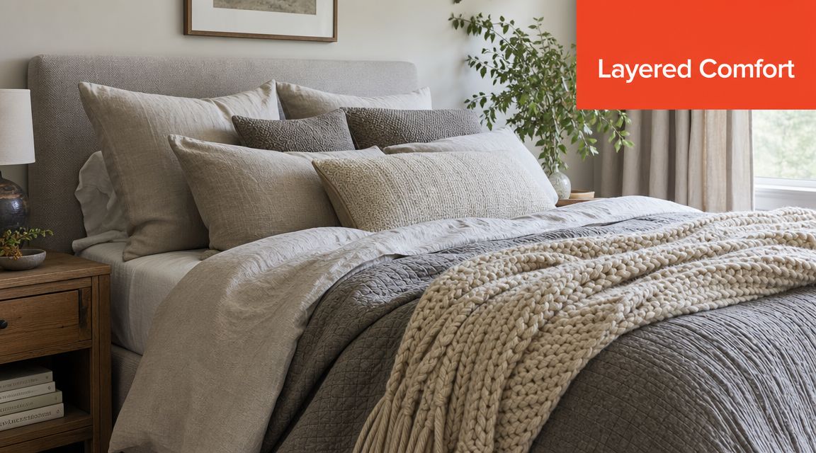
Texture is the value signal
Buyers don't touch everything during a showing, but they read texture immediately. Flat bedding photographs like a budget listing. Layered textiles photograph like a cared-for home.
Use contrast in feel, not just in color:
- Linen bedding softens the room and avoids a glossy catalog look.
- A knit or wool throw adds depth at the foot of the bed.
- Velvet or brushed cotton pillows create a small but visible finish upgrade.
- Natural wood nearby keeps the palette from floating.
A room with modest furniture and strong textile layering will usually outscore a room with pricier furniture and weak bedding. That's because buyers interpret softness as comfort and comfort as value.
The layering order that works
I stage neutral beds from bottom to top in distinct bands. The eye should register structure first, then comfort.
- Start with a carefully chosen base layer in beige or warm greige.
- Add a slightly darker quilt, coverlet, or folded blanket.
- Bring in two or three pillows with mixed texture, not matching showroom sets.
- Finish with one throw that looks usable, not decorative for decoration's sake.
The video below shows the kind of bedding composition agents should study before styling a primary or guest bedroom for photos.
What makes a neutral bed feel cold
The problem usually isn't the palette. It's sameness.
Here's what I remove first when a beige and grey bedroom feels lifeless:
- Matching pillow sets that flatten the bed into a single block
- Shiny polyester throws that catch light in a cheap way
- Tiny accent cushions that clutter instead of soften
- Thin rugs that do nothing for warmth or acoustics
A restful bedroom needs visible softness. If every surface looks smooth, straight, and cool, buyers read the room as sterile before they ever say the word.
Keep the bed looking edited. Hospitality styling works because it suggests ease. One folded throw, a restrained stack of pillows, and an upholstered or wood element nearby is usually enough. More than that, and the room starts performing instead of inviting.
Perfecting Lighting and Accent Choices
Neutral bedrooms don't forgive lazy lighting. If the lamp light is harsh, the beige turns muddy and the grey turns tired. If the room is underlit, the whole palette collapses into shadow.
I use a three-layer lighting system in staged bedrooms because each layer solves a different problem for showings and photography.
Use three layers, not one overhead source
| Lighting layer | What it does | What to use |
|---|---|---|
| Ambient | Fills the room evenly | Ceiling fixture or flush mount |
| Task | Adds functional light near the bed | Bedside lamps or wall sconces |
| Accent | Creates warmth and shape | Small lamp, indirect glow, or light aimed at texture |
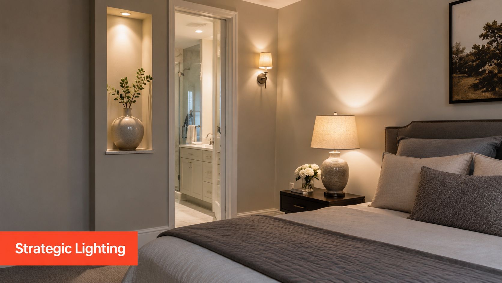
The overhead fixture should never do all the work. It flattens bedding, deepens shadows under furniture, and makes wall color less forgiving. Bedside lamps matter because they create those small pools of light that make a neutral room feel occupied and calm.
If the room only has one lamp, place it on the side that appears in the main listing photo. The purpose isn't symmetry for its own sake. It's to create warmth where the camera is looking.
Pick only two accent directions
Agents over-accessorize beige and grey bedrooms all the time. They add black, brass, blue, greenery, mirrored glass, and patterned art in one pass. That doesn't look curated. It looks unresolved.
Use a two-accent rule. Choose any two of these and stop there:
- Matte black for sharper contrast in lamps, frames, or hardware
- Brushed brass for warmth in fixtures or small decor
- Muted green through a plant or restrained artwork
- Soft blue-grey in one textile or print
What I'd choose in common listing scenarios
For a modern condo bedroom, I'd pair beige and grey with matte black and one organic element, usually wood or greenery.
For a suburban primary bedroom, brushed brass and natural oak usually make the palette feel more welcoming.
For a rental or budget-conscious staging job, I'd keep the accents almost invisible. One lamp finish and one artwork tone are enough. The room should still feel easy for a buyer to personalize.
The cleaner the palette, the more every accent has to earn its place.
The same rule applies to wall art. One larger piece usually works better than a cluster. In a beige and grey bedroom, fragmented art arrangements can make a quiet room feel busy. You want one point of interest, not a gallery wall fighting the headboard.
From Staged Room to MLS-Ready Visuals with AI
A neutral bedroom can stage beautifully in person and still underperform online if the image set loses warmth, texture, or symmetry. Beige and grey are especially unforgiving on camera. Flat exposure makes taupe read dingy, cool shadows can push grey too blue, and one visible cord or crooked lamp can make the room feel less finished than it was at show prep.

AI fits best as the final production layer between staging and the MLS. It protects the work already done in the room and helps the listing go live faster without sending every small correction through a manual editing queue.
Use AI to protect credibility
The highest-ROI edits are corrective, not speculative. Keep the room honest and clean up the details that pull buyer attention in photos:
- Remove minor distractions such as lamp cords, ceiling vent marks, outlet covers in awkward sightlines, or one bedside item that escaped prep
- Balance light so the bedding, wall color, and wood tones read the way they did in person
- Test restrained restyles if you want to compare two beige-and-grey bedding looks without rebooking the shoot
- Pull stills from video when the agent captured a solid walkthrough but not enough final photos
That approach matters for compliance and buyer trust. If the finished images show a room that feels materially different from the actual space, the marketing loses credibility fast.
I train coordinators to ask one question before approving any AI edit: would a buyer walking into this bedroom feel matched to the photos, or misled by them? If the answer is anything but matched, cut the edit.
Build a workflow your team can repeat
For beige and grey bedrooms, the cleanest workflow is usually the one that wins on speed and consistency:
- Stage the physical room first and lock the bed, nightstands, lamps, and art in place.
- Capture bracketed photos or a steady walkthrough video with lights on and window conditions controlled.
- Review for color drift, dark corners, visual clutter, and small alignment issues.
- Use AI to correct presentation problems while keeping the room true to life.
- Export one consistent set for MLS, portals, social, brochures, and property sites.
Bounti Labs fits into that process as a production tool, not a substitute for staging judgment. It can turn a single walkthrough video into stills, MLS-ready photos, and AI-edited marketing assets, including decluttering and restrained virtual restyling. If you are comparing platforms, this review of AI photo editing software for real estate images is a useful place to sort out what level of editing support matches your listing volume.
Why the ROI is real
The spend on a beige-and-grey bedroom should go toward clarity, not excess. Buyers respond when the room reads calm, warm, and move-in ready across every touchpoint, especially on the first scroll through listing photos.
Physical staging gets the room sale-ready. AI helps the final visuals stay consistent with that intent.
That is a practical advantage in neutral bedrooms because subtle color relationships do not survive mediocre editing. If the beige loses warmth or the grey turns cold, the room stops feeling current and starts feeling dull. Good visual production preserves the value of the staging choices and shortens the gap between install day and launch day.
If you want to turn a walkthrough video into polished listing visuals faster, Bounti Labs gives agents a practical way to generate stills, refine room presentation, and create MLS-ready marketing assets without sending every edit through a manual vendor queue.