Black and beige living rooms sell because they photograph cleanly and still leave room for a buyer's imagination. In listing work, that combination matters. A space that feels too styled narrows appeal. A space that feels blank loses energy online.
Beige gives the room warmth and scale. Black adds edges, contrast, and definition that cameras need. Used together, they help a living room read as finished without locking the home into one buyer profile.
That makes this palette useful across price points.
I recommend it often for agents because it solves a real listing problem. You need a room to feel current, easy to understand, and flexible enough for buyers scrolling fast on portals and social feeds. Black and beige can do that in starter condos, suburban resales, and higher-end listings, but only if the balance is controlled. Too much black makes the room feel heavy. Too much beige makes the photos go flat.
The payoff is range. With the right mix of shape, texture, and contrast, this palette can read minimalist, industrial, Scandinavian, glam, or transitional without changing the core color strategy. The neutral room styling advice from Suburban Furniture is still a useful reference point here. Restraint usually markets better than over-accessorizing.
This list is built for agents who want more than inspiration. Each style shows how to stage the look for listings, where the trade-offs show up, and how to use tools like Bounti to test, refine, and scale the setup before the shoot. If you need a practical baseline first, start with this virtual staging guide for real estate listings.
1. Modern Minimalist Black and Beige
Modern minimalist black and beige is one of the safest high-return looks an agent can stage. It makes a room read newer, cleaner, and easier to price in the buyer's mind.
That matters most in condos, newer townhomes, and urban resales where the living room has to carry the listing photos. The palette helps square footage read clearly. Beige keeps the room open and warm. Black adds just enough structure for the camera to catch lines, depth, and separation.

What makes it sell
The win is clarity. Buyers can tell what the room is for within a second or two of seeing the first photo, and that lowers resistance. A beige sofa, pale rug, or warm greige wall gives the space a broad appeal base. Black should stay disciplined. Use it on frames, a coffee table, a floor lamp, curtain rods, or thin shelving, then stop.
Minimalist staging has a real trade-off. Go too sparse and the room feels underfurnished. Add too much decor and the style loses its purpose. The best version lands in the middle. It looks edited, not empty.
Practical rule: Every object in frame should do one job well. Define the layout, soften the room, or strengthen the focal point.
I usually start by removing more than the seller expects, then adding back only the pieces that improve the listing photo. That is also where AI staging earns its keep. If you need to test a tighter furniture plan before the shoot, use Bounti's virtual staging guide for real estate agents.
What works and what doesn't
- Use black in narrow profiles: Thin-framed art, slim lighting, and airy side tables give the room definition without making it feel smaller.
- Choose warm beige over flat tan: The wrong beige looks stale fast, especially under cool LED lighting or heavy editing.
- Leave visible floor area: Minimalist rooms sell better when buyers can read circulation and scale.
- Control contrast at the focal point: A black accent near the sofa or fireplace helps anchor the shot. Too many dark pieces scatter attention.
- Avoid oversized black upholstery: Large dark sectionals absorb light and compress the room in photos.
A useful outside reference for furniture direction is this guide to choosing rustic or industrial furniture. Even though the article focuses on industrial and rustic pieces, the restraint point applies here too. Strong shapes work best when the room is not fighting them.
This style is unforgiving, which is exactly why it works. Weak styling, clutter, poor crop choices, and sloppy retouching all show up fast. In a decent room, that same discipline makes the listing look sharper, newer, and easier for buyers to trust.
2. Industrial Chic Black and Beige
Industrial black and beige living rooms do best in spaces that already have character. Brick, concrete, steel, warehouse windows, exposed ductwork, old wood beams. If the building gives you texture, this style turns it into a story buyers remember.
Beige matters more than people expect here. Raw industrial materials can feel hard in listing photos. Beige upholstery, a nubby rug, or warm drapery softens the room enough that buyers read it as livable, not just edgy.
Use the architecture as the hero
In industrial staging, the worst mistake is competing with the shell. Don't cram the room with decorative pieces trying to “finish” it. Let the brick wall, steel window grid, or concrete column do the heavy lifting.
Black works best when it echoes what already exists. Metal shelving, a black-framed coffee table, or matte black sconces tie the styling back to the bones of the property.
A useful outside reference on furniture direction is this guide to choosing rustic or industrial furniture. It's a good reminder that industrial pieces need restraint, or they start reading theme-heavy.
To show the look in motion, this walkthrough gives the right kind of visual language for the style:
The staging choices that matter
Industrial black and beige living rooms need contrast, but not chaos.
- Warm the seating: A beige sofa or camel-toned accent chair keeps metal and masonry from feeling too severe.
- Edit around statement surfaces: If you have exposed brick, remove nearby visual clutter so buyers notice it.
- Photograph from the edge of the room: Wide angles should show both softness and structure in the same frame.
- Use open shelving carefully: A shelf can reinforce the style. Overfilled shelves kill it.
Raw spaces need softness. Otherwise buyers admire the room and still don't want to live in it.
This look won't help a generic suburban living room much. It can feel forced if there's no authentic architectural hook. But in lofts, adaptive reuse buildings, and city rentals, it gives the listing a point of view fast.
3. Scandinavian Black and Beige
Scandinavian black and beige living rooms help listings look designed without narrowing the buyer pool. For agents, that matters. This is one of the easiest styles to stage for broad appeal because it photographs cleanly, works across price points, and gives ordinary rooms a more expensive read.
The formula is simple. Beige brings warmth. Black adds definition. Pale wood, soft textiles, and negative space keep the room calm enough for buyers to picture their own furniture in it.
Texture does the selling
This style performs best in condos, smaller living rooms, renovated starter homes, and bright apartments with good window exposure. A beige boucle chair, light oak coffee table, black-framed print, and low-pile cream rug usually cover the basics. If the architecture is plain, these pieces add shape without making the room feel staged to death.
Texture matters more than color drama here. Linen curtains, wool throws, matte black hardware, and visible wood grain create contrast that reads well in person and in listing photos. That is the trade-off. Go too flat and the room looks unfinished. Add too many accessories and it starts reading as lifestyle content instead of a home for sale.
For photo prep, this is also a practical style to test digitally before you move inventory in and out. Agents using AI photo editing software for real estate listing images can trial lighter wood tones, slimmer black accents, or simpler rugs to see which version gives the room the strongest online first impression.
Best use cases for agents
- Bright listings: Scandinavian styling rewards natural light and makes clean window lines look intentional.
- Move-up buyers and relocations: The style feels current without reading trend-chasing or region-specific.
- Listings with pale flooring or white walls: You can build the look fast without fighting the existing finish package.
- Vacant or lightly furnished rooms: The restrained palette helps buyers read scale, which is harder in busier staging schemes.
The common mistake is fake coziness. Too many throws, candles, stacked books, and small ceramics clutter the frame and weaken the room's function.
Keep black light and controlled. Slim lamp bases, narrow frames, and one or two dark lines are enough. If every edge in the room is outlined in black, the space loses the softness that makes this style marketable.
4. Contemporary Glamour Black and Beige
Contemporary glamour is the fastest way to make a listing look more expensive than it did the week before. Used well, this black and beige mix signals finish quality, sharper upkeep, and a more premium buyer profile in photos.
Beige carries the room. Black defines the edges. Metal shows up in a controlled way through lighting, hardware, or one table base. If every surface reflects light, the space starts to read staged for Instagram instead of prepared for market.

Luxury reads through editing, not abundance
Agents often miss this style by adding too much. More pillows, more mirrored surfaces, more gold, more decor. The better result usually comes from subtracting until the focal point is obvious.
A glam room needs a clear center. In most listings, that is the fireplace, the main seating vignette, or a large window wall. Build around one strong beige anchor, then add black through frames, a coffee table, lighting, or a single chair so the contrast looks deliberate. If the room already has ornate molding, glossy floors, or dramatic stone, reduce the accessories further. Architecture can do part of the work.
Apartment Therapy documented a living room transformation that replaced a dated beige-heavy scheme with a sharper black-and-white palette built around Sherwin-Williams Tricorn Black and Benjamin Moore Chantilly Lace, giving the fireplace stronger presence and a more current identity (Apartment Therapy living room transformation). That same staging principle applies in black and beige listings. Strong contrast makes older features look chosen instead of leftover.
For agents pitching this look to sellers, visual proof helps. Bounti's house staging before and after examples are useful for showing how a room can feel more upscale after simplifying the palette and tightening the focal points. If the room photographs well but still needs polish, this guide to AI photo editing software for real estate visuals covers tools that help clean up brightness, verticals, and finish detail without changing the design itself.
Where this style earns its keep
- Luxury condos and renovated urban listings: Black accents sharpen the architecture and help premium finishes register in listing photos.
- Rooms with one strong focal feature: Fireplaces, statement windows, and slab surrounds benefit from controlled contrast.
- Homes competing on finish level: This look supports higher perceived quality without requiring a full redesign.
- Seller-occupied spaces with decent core furniture: You can often get there by editing, swapping textiles, and upgrading lamps and art instead of replacing everything.
The mistakes are predictable.
- Too much shine: One reflective finish is enough. Several reflective finishes scatter attention.
- The wrong beige: Yellow-beige can age the room. Cream, oat, taupe-beige, or soft greige usually photograph better.
- Black used too lightly: If black only appears in one lamp, it looks accidental.
- Mixed metals with no logic: Brass, chrome, and matte black can work together, but only when one finish leads and the others stay secondary.
Buyers do not need to admire the styling. They need to feel that the home supports a more polished lifestyle than the competing listing down the street.
This style works best where the architecture can carry some formality. In entry-level homes, keep the glamour cues tight and practical. One better light fixture, cleaner art, and stronger contrast will sell the idea without pushing the room into fantasy.
5. Transitional Black and Beige
Transitional black and beige living rooms sell more listings than trend-heavy looks because they make fewer buyers hesitate. For agents, that matters. This style gives the room a finished, current feel without asking buyers to accept a strong design point of view.
It is the safest high-ROI option for suburban resale, move-up homes, and seller-occupied properties with mixed finishes. Beige carries the room through upholstery, walls, rugs, or flooring. Black should be repeated with intent in lighting, frames, tables, or a fireplace surround so the contrast looks designed, not accidental.
The style that fixes mixed finishes
Transitional works well when the house already has a little tension in it. Older millwork, newer hardware, builder-grade floors, and a traditional sofa can live together if the staging gives them one visual system. Use beige as the base, black as the organizing color, and keep any third note restrained. Medium wood, muted green, or warm brass usually does enough.
I use a simple staging rule here. The room should read balanced before it reads styled. That means matched visual weight, one clear focal point, and enough repetition that listing photos feel calm. If you need a seller-friendly proof point, Bounti's house staging before and after examples are useful for showing how small edits can make a familiar room look market-ready.
What stays, what goes
- Keep furniture with classic scale: Sofas with clean but familiar lines usually work, especially if the proportions fit the room.
- Cut random dark wood pieces: One espresso end table from 2009 can age the whole photo set. Replace or paint for consistency.
- Anchor the room with a real focal point: Fireplace, largest window, or built-in media wall. Pick one and stage toward it.
- Use black more than once: A single black lamp looks leftover. Repetition across lighting, art, and a table base creates structure.
- Prove the room functions for daily life: Add a readable conversation area, usable side tables, and a rug that fully connects the seating.
There is a trade-off. Transitional can drift into bland if every piece is safe and every surface is beige. The fix is controlled contrast, not more decor. Stronger lamps, sharper art, better pillows, and fewer accessories usually do more for the listing than buying another accent chair.
This style earns its keep by removing objections. Buyers can picture their own furniture, routines, and family life in the room, which is exactly what helps a listing hold attention and convert showings into offers.
6. Japandi Black and Beige
Japandi black and beige living rooms are quiet, but they aren't plain. They work by making emptiness feel valuable. That's a useful trick in listings because open space reads as flexibility, calm, and better scale.
The danger is that some agents mistake Japandi for underfurnished minimalism. It isn't. Good Japandi has weight, texture, and discipline. Beige softens the room through plaster-like walls, natural fibers, and pale woods. Black appears in low-profile wood frames, ceramics, or a restrained lighting fixture.
Space is part of the staging
This style fits wellness-oriented properties, renovated homes with natural materials, and listings where buyers respond to calm more than status. If the room has good daylight and clean architecture, Japandi can make the entire listing feel more expensive without adding much furniture.
You need to be ruthless about clutter. Small accessories break the spell fast. So do shiny surfaces. Japandi wants matte finishes, visible grain, and enough negative space that the room feels composed.
In black and beige living rooms with a Japandi lean, empty floor area is not wasted space. It's a selling feature.
The real trade-off
Japandi isn't for every market segment. Some buyers will love the serenity. Others will read it as sparse, especially in family-heavy neighborhoods where people expect rooms to look fuller and more conventional.
When I'd use it:
- Architectural homes with clean lines
- Eco-conscious or design-aware buyer pools
- Listing photos with strong natural light
- Rooms that already have good built-ins or strong flooring
When I wouldn't:
- Dark rooms with low ceilings
- Traditional homes with ornate detailing
- Seller-occupied homes full of visual clutter you can't fully edit
AI restyling can help here because the line between serene and empty is thin. Test a few furniture densities before finalizing the look.
7. Mid-Century Modern Black and Beige
Mid-century modern is one of the safest ways to make a black and beige living room look expensive in listing photos without making it feel over-staged. The style already favors clean lines, warm wood, and disciplined contrast, so the palette reads intentional fast.
That matters most in homes with actual mid-century features. Low fireplaces, long sightlines, clerestory windows, wood paneling, and original built-ins give this look credibility. In a newer property, it can still work, but the staging needs more restraint or it starts to look like a theme instead of a fit.
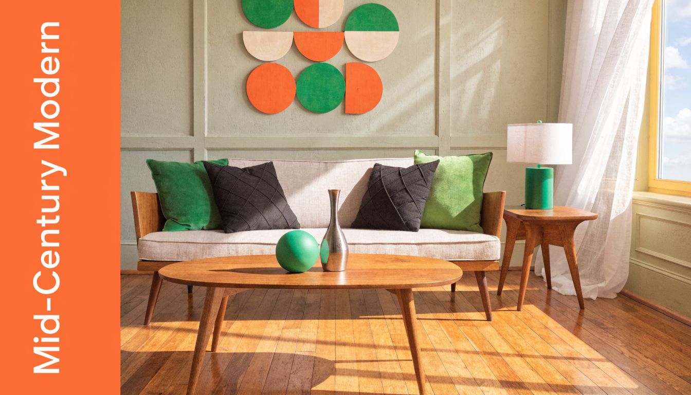
Keep the era visible, but sale-ready
Agents get better results when the room references the period instead of copying it. A walnut or teak case piece, a beige sofa with a low profile, a black accent chair, and a geometric rug usually do the job. Add one sculptural lamp or one piece of graphic art, then stop.
Too many era-specific accessories hurt marketability. Buyers should notice the architecture first, then the styling. If every surface is packed with ceramics, starburst motifs, and novelty decor, the room starts reading as a collector's set, not a livable space.
This is also a smart section to test with AI staging tools like Bounti before you commit. Mid-century styling depends on proportion. One oversized sectional or one bulky coffee table can break the whole composition, and that mistake shows up fast in photos.
What sells in this version
Use the style to support the home's strongest features, not compete with them.
- Call out original details in the listing copy: Built-ins, paneling, fireplace shapes, and window lines help justify the design direction.
- Choose furniture with visible legs and low profiles: That keeps the room open and lets buyers read the floor plan.
- Keep black to frames, lighting, and a few anchor pieces: Black should define the room, not dominate it.
- Bring in warm wood on purpose: Walnut, oak, or teak prevents beige and black from feeling cold or flat.
- Edit accessories hard: Mid-century rooms photograph best with a few strong objects, not a lot of small ones.
The trade-off is warmth versus sharpness. Push too far toward black, and the room feels severe. Push too far toward beige, and you lose the crisp lines that make this style photograph so well. The best listing version sits in the middle, polished enough to feel designed, relaxed enough that buyers can picture their own furniture in it.
8. Eclectic Black and Beige with Accent Colors
Eclectic black and beige works best when a listing needs distinction. It gives agents a way to stage personality into the room without giving up the clean, saleable base that photographs well.
Use this approach for homes with architectural quirks, older properties with collected character, or listings aimed at buyers who expect more than a standard neutral setup. Black sets the frame. Beige keeps the room warm and approachable. Accent color does the selling work by giving buyers one or two details they remember after they scroll past the photos.
Control matters more here than in any other version on this list.
Accent colors should show up with intent, not by accident. Forest green, rust, navy, and burgundy all work inside a black and beige scheme, but only when they repeat in a tight pattern. A single lounge chair, one strong piece of art, and a small group of textiles usually does the job. Once accent color spreads across every surface, the room stops reading as curated and starts reading as busy.
A Glasgow apartment case study showed the value of that restraint. The redesign paired a dark wall treatment with beige flooring and produced a sharper, more premium result than the heavier, earth-tone version it replaced (Glasgow living room case study). The lesson applies to listings: contrast gets attention, but the neutral base keeps the room marketable.
How to use accent color strategically
- Match the accent to the buyer profile: Rust and olive often fit character homes. Navy reads cleaner in urban condos. Burgundy can work in higher-end listings if the finishes already support it.
- Pick one accent color and repeat it two or three times: That gives the eye a pattern to follow and keeps photos from looking random.
- Keep large pieces neutral: Sofas, rugs, and major case goods should stay in black, beige, wood, or cream so the room still appeals to a broad buyer pool.
- Use art and soft goods for the color hit: They are faster to swap, cheaper to test, and easier to adjust after the first photo review.
- Mock up options before staging day: Bounti is useful here because eclectic rooms can go off-course fast. Test a few accent directions in AI staging, compare the photo impact, then stage the version that strengthens the listing instead of distracting from it.
The trade-off is memorability versus universality. A safe room pleases everyone and sticks with no one. An eclectic room can create stronger recall, but only if the styling stays edited enough that buyers still see the square footage, light, and layout first.
That is the standard to hold. If the color story helps the room stand out while the home still feels easy to move into, the staging is doing its job.
Black & Beige Living Rooms, 8-Style Comparison
| Style | 🔄 Implementation Complexity | ⚡ Resource Intensity | 📊 Expected Outcomes (⭐) | Ideal Use Cases | 💡 Key Advantages / Tips |
|---|---|---|---|---|---|
| Modern Minimalist Black and Beige | Medium, requires disciplined decluttering and layout planning | Medium, quality basics, lighting, hidden storage | Highly photogenic; broad buyer appeal ⭐⭐⭐⭐ | Urban condos, contemporary listings, millennial-targeted properties | Clean lines + 2–3 black accents; ensure strong natural light |
| Industrial Chic Black and Beige | High, integrate or faux-expose structural elements carefully | Medium–High, materials like metal, brick, statement fixtures | Strong visual impact; memorable but niche ⭐⭐⭐⭐ | Loft conversions, creative urban neighborhoods, adaptive reuse | Highlight architecture with lighting; add warm textiles to soften |
| Scandinavian Black and Beige | Medium, emphasis on light, functional pieces and layering | Medium, natural wood/textiles investment | Inviting, airy photos; great for small spaces ⭐⭐⭐⭐ | Boutique apartments, eco-conscious urban markets, small homes | Layer natural textiles; prioritize golden-hour photos |
| Contemporary Glamour Black and Beige | High, requires luxe finishes and precise styling | High, luxury furnishings, metallics, pro photography | Premium, aspirational results; commands top pricing ⭐⭐⭐⭐⭐ | High-end penthouses, luxury developments, affluent listings | Stage sparingly with high-end focal pieces; use pro lighting |
| Transitional Black and Beige | Low–Medium, mix classic and modern elements with balance | Medium, mainstream quality furniture suffices | Broad-market appeal; versatile and safe choice ⭐⭐⭐⭐ | Suburban family homes, model homes, upper-middle market | Use quality mid-range pieces and clear focal points |
| Japandi Black and Beige | High, needs expert curation to achieve serene balance | High, premium natural materials and low-profile pieces | Calm, meditative visual appeal; niche wellness market ⭐⭐⭐⭐ | Wellness-focused developments, luxury minimalist homes | Emphasize negative space and plants; declutter meticulously |
| Mid-Century Modern Black and Beige | Medium–High, requires authentic silhouettes and proportion | High, original or high-quality reproductions cost more | Distinctive, collectible appeal; strong design credibility ⭐⭐⭐⭐ | Historic mid-century neighborhoods, design-forward listings | Curate iconic pieces; use photography to highlight details |
| Eclectic Black and Beige with Accent Colors | High, careful curation needed to avoid clutter | Medium–High, varied quality accents and art required | Personality-driven results; variable depending on curation ⭐⭐⭐ | Designer showcases, boutique rentals, styled model homes | Limit accents to ~15–20% of palette; test color schemes with restyling |
From Inspiration to Instant Staging
Black and beige living rooms keep showing up because they solve a real marketing problem. Listings need rooms that feel refined, photograph cleanly, and still appeal to a broad buyer pool. This palette does that better than most. Beige softens and expands. Black defines and sharpens. Together, they make a room easier to read on screen and easier to imagine living in.
The biggest mistake agents make is treating black and beige as a decorative trend instead of a positioning tool. A minimalist version helps compact condos feel bigger. A transitional version helps family homes feel updated without looking unfamiliar. A glam version can push a luxury listing toward a more aspirational identity. The palette stays the same, but the staging strategy changes with the property.
Lighting and editing matter just as much as furniture choice. One of the clear gaps in available design advice is practical guidance on how black and beige rooms should be lit for digital marketing, especially because many buyers start their search online and first encounter the property through photos or tours (lighting strategy gap for black and beige spaces in real estate marketing). If black is swallowing corners or beige is washing out, the issue usually isn't the palette. It's execution.
Market fit matters too. Another gap in the conversation is segmentation. Not every region, buyer demographic, or price point responds to black and beige in the same way, and agents need to judge whether they should push matte black minimalism, softer warm-neutral styling, or a lighter transitional version for their audience (cultural and regional preference gap in black and beige design). Good staging starts with the probable buyer, not the agent's personal taste.
That's where AI becomes useful. Instead of debating one “best” look, you can test multiple black and beige living rooms against the same property. Declutter one version. Stage another with mid-century pieces. Restyle a third with a softer Scandinavian mix. Compare what reads best for the room's architecture and likely buyer profile. That speed changes the job. You're no longer waiting on manual revisions to see whether a direction works.
If you're building listing content at scale, think of these eight styles as repeatable templates. Match the room to the right version, keep the black disciplined, make beige carry warmth instead of dullness, and use AI to shorten the trial-and-error cycle. The result is better visual consistency across listings and faster decision-making with sellers.
If you need one final color principle to keep the room grounded, this roundup of perfect living room color palettes is a helpful companion. The best listing palette isn't the boldest one. It's the one that makes buyers stop scrolling and stay long enough to want the showing.
Bounti Labs helps agents turn black and beige living rooms from an idea into finished listing assets fast. With Bounti Labs, you can start from a single walkthrough and generate MLS-ready photos, decluttered images, virtual staging options, restyled interiors, and even renovation concepts without waiting on slow manual vendors. If you want to show sellers multiple design directions, tighten your marketing turnaround, and make every property look more marketable, Bounti gives you the speed and flexibility to do it.