Grey and white still wins listings, but only when it reads as intentional value, not default builder finish.
Agents use this palette because it photographs cleanly, travels well across buyer tastes, and gives furnished or virtually staged rooms a consistent base. The mistake is treating grey as the feature instead of the framework. In a listing photo, too much flat grey drains contrast, weakens focal points, and makes the room feel colder than it does in person.
That matters because buyers make snap judgments. A grey and white living room can signal modern, well-kept, and move-in ready. It can also signal cheap flip, generic new build, or a space the seller never finished. The difference usually comes down to discipline: where the grey sits, how white balances it, what texture breaks it up, and whether the room holds up once the camera brightens every surface.
For agents, this is a pricing and presentation decision as much as a design choice. The goal is to widen appeal without stripping out character, then make sure the room performs in photos, tours, and AI staging workflows. If the base images need cleanup before you restyle or stage digitally, this guide to AI photo editing software for real estate images helps tighten the visual foundation first.
Use grey and white well, and the living room looks sharper, cleaner, and more expensive. Use it poorly, and the home loses emotional pull before a buyer ever books a showing.
1. Minimalist Grey and White Color Blocking
Color blocking works when the room needs structure more than decoration. In open-plan homes, lofts, and newer builds, broad zones of white and grey can make the living area feel designed instead of undefined. That's especially useful when the architecture is simple and you need the eye to move with purpose.
Keep the palette disciplined. White should remain the dominant field, grey should anchor the room, and a small warm accent should interrupt the coolness so the listing doesn't feel sterile.
How to make the blocks read on camera
Use a matte grey accent wall when the room has strong daylight or glossy finishes nearby. Matte surfaces reduce glare and help the wall photograph as a solid plane instead of a patchy reflection source. Then repeat that grey in one or two major pieces, such as the sofa or an area rug, so the color block feels deliberate.
For AI-ready listing media, clean white surfaces matter more than agents think. Smudges, outlet discoloration, and small wall marks jump out once images are brightened. An editing workflow helps in these situations. If the base photography needs cleanup before you stage digitally, a review of AI photo editing software for real estate images is a good starting point.
Practical rule: If every major surface is the same cool grey, the room doesn't look luxurious. It looks unfinished.
A Brooklyn loft with concrete tones can handle stronger grey zoning than a suburban family room with beige flooring. Match the blocking to the fixed finishes already in place. If the floors run warm, bring in a warmer grey instead of fighting the room.
2. Layered Textures with Monochromatic Palette
A grey and white living room fails most often because it's too smooth. Same-tone walls, flat upholstery, and a single rug create a room that looks clean in person but dead in photos. Texture fixes that without forcing color where it doesn't belong.
The fastest way to create depth is to stack materials that catch light differently. Linen diffuses it. Velvet deepens it. Boucle softens the frame. Leather sharpens the edge. Even when the room stays almost entirely neutral, those shifts create dimension that buyers can feel through the screen.
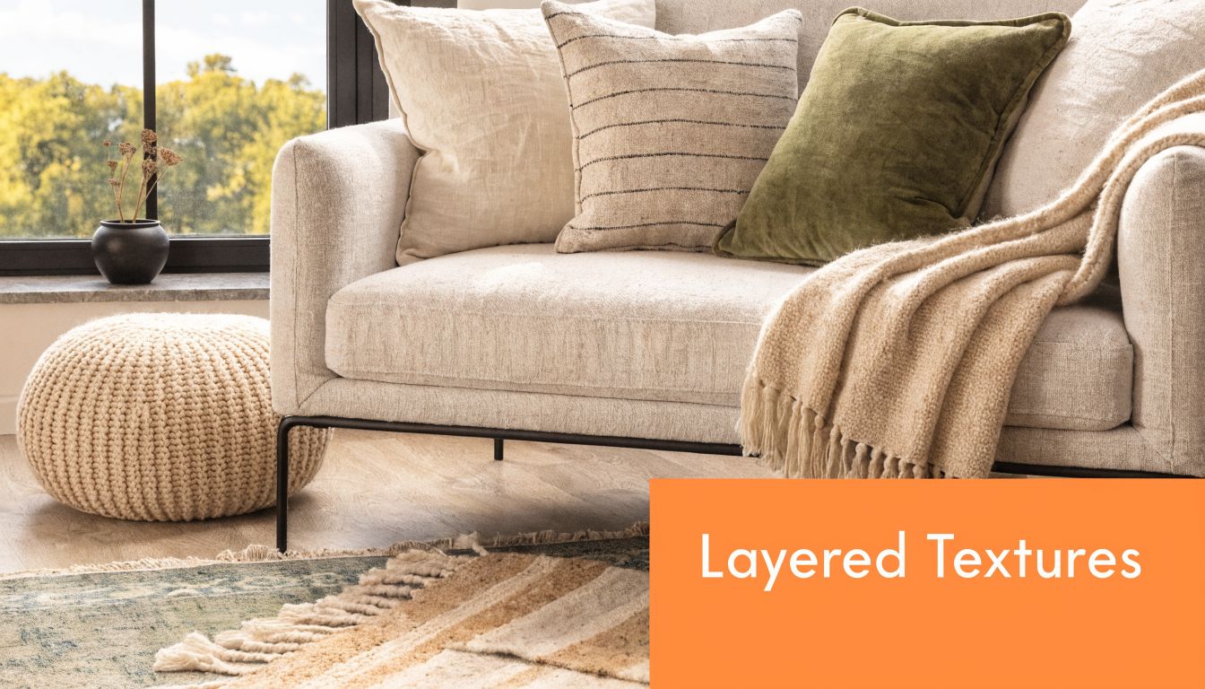
Texture choices that help a listing
Don't spread texture evenly across every piece. Concentrate it where the camera lingers most.
- Sofa first: Choose a sofa with visible weave, channeling, or a nubby fabric so the main seating piece carries visual weight.
- Rug second: Layer a softer rug over a flatter base when the floor plane feels too empty.
- Pillow mix: Use different finishes, not just different shades. A white knit pillow beside a smooth grey lumbar reads better than three nearly identical cushions.
- Window-side placement: Put natural fibers where side light can create shadow and surface variation.
In practice, this works well in West Elm-style rooms, Pottery Barn-inspired family spaces, and staged condos that need polish without personality overload. If the room already has dramatic architecture, use fewer texture types. If it's a basic rectangle, use more. The staging should compensate for what the room lacks, not compete with what it already has.
3. Statement Lighting as Focal Point
When the room itself is neutral, the ceiling fixture often becomes the one thing buyers remember. That's useful. In a grey and white living room, statement lighting creates hierarchy. It tells buyers where to look first, and that matters in thumbnail views where the room has less than a second to make its case.
Lead with shape, not ornament. A sculptural pendant, linear chandelier, or clean brass fixture can refine a standard room without making it feel overdesigned.
A good example of the look:

What works in listing photos
The finish should tie back to the hardware and furniture legs in the room. Matte black can sharpen a modern listing. Brass can warm up a cool palette. Chrome works when the architecture already feels crisp and urban.
Lighting also translates especially well in digital staging, because it gives the software and the viewer a clear focal point to organize the room around. If you're building a room concept virtually, this kind of virtual staging guide for real estate listings helps frame the sequence correctly: set the anchor pieces first, then support them.
A grey room without a focal point feels temporary. A grey room with strong lighting feels curated.
Scale is where many agents miss. Small fixture in a big room, and the whole scene collapses. Oversized fixture in a tight room, and it feels crowded. In listing prep, I'd rather slightly overshoot than undershoot, as long as the proportions still respect the ceiling height and furniture grouping.
For motion assets, show the lighting in context, not just as a still feature.
4. Large-Scale Artwork and Wall Art
Blank walls make a grey and white living room feel cheaper than it is. One large artwork usually performs better than several small pieces because it simplifies the frame and gives the room a center of gravity. In listing photography, that matters more than personal expression.
Abstract work is the safest route. Black and white compositions, tonal abstracts, or pieces with restrained beige, charcoal, or soft earth notes help the room feel finished without narrowing buyer taste. In luxury condos, agents often use oversized art almost like an architectural feature. That's the right mindset.
Placement that sells instead of distracts
Hang art relative to the furniture, not the wall dimensions alone. Over a sofa, the piece should feel connected to the seating area rather than floating in empty space. If the room has low ceilings, horizontal artwork can visually widen the wall. If the room is narrow, a vertical piece can add needed height.
A few practical calls make a big difference:
- Choose one hero wall: Don't spread visual attention around the room.
- Keep the palette restrained: The art can introduce mood, but not so much color that buyers fixate on style over space.
- Light it properly: If possible, angle natural or fixture light so the art reads clearly without glare.
- Use removable options in occupied homes: You need impact, not installation drama.
This approach works well in Manhattan-style apartments, new-construction living rooms, and rentals where furniture is basic but the walls need authority. Art should support the room's value narrative. It shouldn't become the entire narrative.
5. Geometric Patterns and Modern Rugs
Pattern is useful when a neutral room feels too polite. The right geometric rug or pillow arrangement adds movement and sharpens the room's style language without introducing visual chaos. In a grey and white living room, geometry signals intention.
Stick with patterns that buyers already understand. Stripes, grids, herringbone, and restrained abstract geometry age better than trend-heavy motifs. You want something that feels current in photos without locking the room to one very specific era.
Where to place the pattern
Put the strongest pattern on the floor if the room has plain upholstery and simple walls. Put the strongest pattern on pillows if the flooring or fireplace already has texture. Don't run bold geometry through every surface at once. That turns a calm palette into visual static.
A practical setup often looks like this:
- Patterned rug, solid sofa: Best for large living rooms where the floor plane needs definition.
- Solid rug, patterned pillows: Better for smaller rooms where a busy floor would tighten the frame.
- Two pattern notes max: One dominant pattern and one supporting pattern is usually enough.
- Keep architecture visible: If the room has good windows, molding, or a fireplace, pattern should frame those assets, not compete with them.
For washable and practical inspiration, product categories like those discussed by The Sofa Cover Crafter on gray and white rugs reflect the kinds of combinations agents can borrow for everyday listing prep.
6. Natural Elements and Live Greenery
Greenery is one of the fastest ways to keep a grey and white living room from feeling cold in listing photos. For agents, that matters because buyers do not score a room on color theory. They react to whether the space feels clean, current, and easy to live in.
Organic elements do that job well. A controlled dose of plant life and natural wood softens hard edges, adds color contrast, and keeps a neutral room from reading flat on camera.
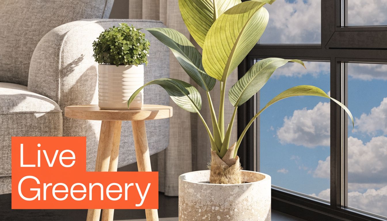
The right amount of green
Use restraint. One floor plant, one tabletop plant, and one wood note is usually enough to change the read of the room.
A tall plant can repair an empty corner that looks dead in wide-angle shots. A snake plant near a media console adds height without eating floor space. A pothos on a shelf breaks up straight lines and helps built-ins feel less rigid. If the home gets weak natural light, use fewer plants and choose varieties that still look healthy under interior conditions. Half-dead greenery hurts perceived value faster than no greenery at all.
Use greenery as punctuation, not wallpaper.
Wood matters too. Oak, walnut, or even a light ash side table gives the room temperature and texture in a way another white accessory never will. That trade-off is practical. A single warm wood piece often delivers more visual return than adding more decor objects that read as clutter.
This also translates well to AI staging and virtual restyling. Small injections of green and timber help renders look more believable, which matters when agents are using tools like Bounti to produce listing-ready images at speed. For shape and plant selection ideas, even a consumer guide like choosing the right cactus for home can help you spot forms that photograph cleanly in modern neutral spaces.
7. Luxe Metallics Gold Silver and Brass Accents
Metallics are where a neutral room starts to feel expensive. Not because metal itself signals luxury, but because reflective finishes create contrast in a palette that can otherwise look matte and flat. In a grey and white living room, that contrast reads as finish quality.
Brass is the easiest warmer option. Chrome and polished nickel feel cleaner and more urban. Blackened metal works when the room already has strong lines and enough light to keep the look from turning heavy.
Keep the finish tight
Pick one dominant metal and one secondary one, if needed. More than that and the room starts to look assembled from leftovers. The cleanest use of metallics is usually small and repeated: lamp base, coffee table frame, mirror frame, hardware, tray.
Polish before every shoot. Dull brass doesn't read as refined. It reads dusty. Reflection control also matters. Position reflective accents where they catch light, but don't bounce glare back into the camera.
For agents who add greenery to soften the room, accent styling can cross over well with adjacent decor choices. Even a lifestyle piece like choosing the right cactus for home can spark ideas for combining sculptural plants with metallic planters in a restrained neutral setting. Just keep the final staging cleaner and more marketable than a decor blog setup.
8. Statement Mirror Placement and Large-Scale Reflective Surfaces
Mirrors do two jobs in a listing. They increase perceived light and they create spatial expansion without adding furniture. In a grey and white living room, that's powerful because the palette already depends on brightness and openness to feel premium.
The mirror's placement matters more than its style. Put it where it can borrow something attractive. Natural light is best. Architectural detail is second best. A mirror that reflects a blank hallway or cluttered sideboard makes the room worse, not better.
Mirror rules that hold up in photos
Opposite a window is still the strongest move when the view is decent. If the windows face a neighboring wall, angle matters. You don't want the mirror amplifying the room's weakest sightline. In tighter spaces, a leaning floor mirror can feel more contemporary and less fussy than a heavily mounted formal piece.
Agents staging luxury apartments often use one oversized mirror instead of several decorative ones because the larger surface reads as architectural. That's the right call for most modern listings. Smaller mirrors can look accessory-heavy unless the home itself is more traditional.
Cleanliness isn't optional here. Dust, fingerprints, and haze all show up fast once the image is edited for brightness. If you're using AI staging afterward, a clean reflective surface gives the software a better starting point and makes the final image feel more credible.
9. Modern Furniture with Clean Lines and Mixed Materials
The furniture should make the room feel larger than it is. That's why clean-lined pieces outperform bulky traditional seating in most grey and white living room staging. Straight arms, open legs, and visible negative space help buyers read the room faster.
This is also where material contrast matters. A neutral palette needs shape and finish variation to avoid looking generic. Glass, metal, wood, and upholstery should all have a role. Even if the colors stay tight, the materials keep the room from flattening out.
What to stage and what to skip
Skip overstuffed recliners, heavy skirted sofas, and oversized entertainment units unless the property's architecture clearly supports a more traditional look. In most listing environments, those pieces eat square footage on camera. Instead, use a sofa with exposed legs, a coffee table with a lighter visual footprint, and side chairs that don't block sightlines.
A useful before-and-after mindset is to look for every piece that interrupts flow and replace it with one that clarifies space. Galleries of house staging before and after transformations are helpful because they show how much room value comes from editing, not just adding.
- Use glass sparingly: A glass coffee table can open the center of the room, but too many transparent pieces can feel insubstantial.
- Bring in one wood note: This keeps the room from feeling like a showroom set.
- Mind leg lines: Furniture that sits visibly off the floor usually photographs lighter.
- Create one clear conversation zone: Scattered pieces make the room feel smaller and less functional.
10. Windowed Wall Treatments and Minimalist Window Coverings
Window treatments in a grey and white living room should control light without announcing themselves. Most agents either overdress the windows or leave them awkwardly bare. Both mistakes cost you. The right treatment sharpens the room and supports the photography.
White sheers, soft grey linen panels, and clean roller shades tend to work best because they preserve the palette's calm while still giving the room depth. Floor-to-ceiling mounting also helps the room read taller, which is one of the easiest visual wins in listing prep.
How to use them strategically
If the view is strong, open the treatment fully for primary listing images. If the view is weak or privacy is an issue, use filtered light instead of blackout coverage. Buyers still want to feel daylight, even when they can't have the full window exposure.
This matters even more in digital marketing. Existing coverage of grey and white living rooms often focuses on decor, but it rarely translates those choices into image optimization for AI staging and online presentation. That gap matters because Real Homes notes that 85% of home buyers in major markets begin their search online, which raises the bar for how carefully agents manage light, warmth, and neutrality in the images themselves.
If the windows are the room's strongest feature, the coverings should frame them, not compete with them.
In practical terms, that means crisp hems, clean rods, no puddling unless the property is clearly luxury-forward, and no dark drapery in a room already leaning cool. Grey and white works best when the windows still feel like the brightest part of the scene.
10-Point Grey & White Living Room Design Comparison
Agents do not need more decor inspiration. They need a fast way to decide which grey and white setup will photograph well, justify price, and create fewer objections during showings. Use this comparison as a listing-side decision tool, especially when you are choosing between physical staging, partial refreshes, or AI staging workflows in Bounti.
| Design Approach | Implementation Complexity 🔄 | Resource Requirements ⚡ | Expected Outcomes 📊⭐ | Ideal Use Cases 💡 | Key Advantages ⭐ |
|---|---|---|---|---|---|
| Minimalist Grey and White Color Blocking | Medium, requires clean paint lines and disciplined furniture placement | Low to Medium, paint, limited furnishings, staging time | Makes rooms read larger in photos, supports broad buyer appeal 📊 ⭐⭐⭐⭐ | MLS photography, modern condos, lofts | Clean visuals, fast staging, durable resale look |
| Layered Textures with Monochromatic Palette | Medium, depends on tight material selection | Medium, textiles, rugs, throws, accessories | Adds warmth and rich visual depth, softens minor flaws 📊 ⭐⭐⭐⭐ | Higher-end listings, primary living rooms, marketing shoots | Strong depth without adding more color noise |
| Statement Lighting as Focal Point | Medium to High, scaling and install choices matter | Medium to High, fixture cost, installation, dimmers | Strong visual impact, increases perceived value 📊 ⭐⭐⭐⭐ | Dining areas, entry sequences, twilight images | Clear focal point, stronger finish quality |
| Large-Scale Artwork and Wall Art | Low to Medium, art choice and hanging need precision | Medium, purchased or rented art | Creates focal interest and a more finished presentation 📊 ⭐⭐⭐⭐ | Blank feature walls, condos, staged model homes | Big visual return without changing the palette |
| Geometric Patterns and Modern Rugs | Low, mainly sourcing and placement | Low, rugs, pillows, smaller accents | Adds movement, breaks up flat surfaces, helps conceal wear 📊 ⭐⭐⭐ | High-traffic rooms, contemporary staging | Affordable interest, practical cover for tired flooring |
| Natural Elements and Live Greenery | Low to Medium, upkeep matters | Low, plants, planters, light maintenance | Brings warmth and freshness, reduces the cold feel of grey-heavy rooms 📊 ⭐⭐⭐⭐ | Living rooms, corners, eco-minded listings | Adds life, improves photo mood |
| Luxe Metallics: Gold, Silver, Brass Accents | Low to Medium, finish consistency is the risk | Medium, hardware, fixtures, accents | Adds brightness through reflection and signals a higher-end finish 📊 ⭐⭐⭐⭐ | Kitchens, baths, upscale condos | Quick polish, better light play |
| Statement Mirror Placement & Reflective Surfaces | Low to Medium, position is everything | Medium, oversized mirrors, mounting hardware | Increases perceived size and brightness 📊 ⭐⭐⭐⭐ | Small rooms, entries, darker interiors | Expands the room visually, helps weak natural light |
| Modern Furniture with Clean Lines & Mixed Materials | Medium, pieces need to coordinate without looking sparse | Medium to High, furniture rental or purchase | Keeps the room open, current, and easy for buyers to read 📊 ⭐⭐⭐⭐ | Full-home staging, new developments, urban listings | Supports flow, photographs well across angles |
| Windowed Wall Treatments & Minimalist Coverings | Medium, accurate measurement and install required | Medium, fabric, hardware, optional motorization | Manages light while keeping the room visually open 📊 ⭐⭐⭐ | Window-forward rooms, luxury listings | Better light control, cleaner presentation |
The trade-off is simple. The strongest option is not always the most stylish one. It is the one that improves photos, reduces visual friction, and matches the buyer profile for that listing.
For agents, that usually means choosing one primary move and one supporting move instead of stacking all ten. A condo with limited square footage may get the best return from mirrors plus clean-lined furniture. A dated suburban listing may benefit more from layered texture plus large-scale art. AI staging makes that testing process faster because you can compare directions before spending on rentals, installs, or accessory runs.
From Palette to Payday Your AI Staging Advantage
Grey and white remains a useful staging palette because it's adaptable, familiar, and easy to scale across listing types. It also fits how many buyers already shop visually. The global living room furniture market reached USD 226,512.2 Million in 2023 and is projected to reach USD 389,235.3 Million by 2032 at a 6.20% CAGR, according to Credence Research's living room furniture market report. That doesn't mean every buyer wants a cold monochrome room. It does mean neutral living room aesthetics remain commercially relevant, widely marketed, and closely tied to how homes are presented.
For agents, the opportunity isn't to copy the old millennial-grey formula. It's to use grey and white as a flexible base, then control the variables that influence perception: warmth, texture, focal points, light, and editing discipline. The room has to feel calm, not lifeless. Refined, not generic. Neutral, but still memorable.
That's where AI staging becomes more than a convenience. It gives you speed without forcing one static design decision. Instead of physically testing multiple layouts, swapping accessories, or ordering rush staging just to find the strongest version of the room, you can evaluate several directions quickly. You can show a cooler contemporary option, a warmer mixed-material version, or a cleaner minimalist setup, then choose the one that best supports the property's price point and likely buyer profile.
This is especially useful with grey and white living rooms because the trade-offs are subtle. Small shifts in wood tone, plant placement, lighting finish, or wall art scale can change the entire emotional read of the room. In a physical staging workflow, that takes time and budget. In an AI workflow, it becomes part of the agent's marketing process.
That's also why tools built for listing visuals have become part of the modern presentation package. Bounti Labs is one option in that category. Based on the company's product description, Bounti can generate listing photos, declutter images, stage rooms, restyle interiors, and create marketing assets from a single video walkthrough. For agents handling more listings with less production time, that kind of workflow can turn a grey and white living room from a neutral default into a customized selling tool.
The bigger point is simple. A grey and white living room shouldn't be staged because it's trendy. It should be staged because it helps buyers focus on space, light, and possibility. When you pair that palette with disciplined execution and modern image production, you don't just get a prettier listing. You get a sharper value story. And that's what helps win instructions, attract stronger attention, and move properties with less friction.
If you're already using digital presentation tools, it's worth also looking at adjacent workflows like staging empty listings with AgentPulse to compare how different platforms fit your listing process.
Bounti Labs helps agents turn a simple walkthrough into marketing-ready visuals, listing copy, and AI-powered staging options that make spaces like a grey and white living room easier to position for the right buyer. If you want a faster way to test layouts, restyle neutral rooms, and present polished images without waiting on manual vendors, explore Bounti Labs.