Why Most Grey and Yellow Living Rooms Fail to Sell
The grey yellow living room has been a design staple for years. That's exactly why so many listings get it wrong. Agents copy the same dated formula. Grey sofa, random yellow pillows, generic wall art, and no clear reason for any of it. Buyers have seen that room before, and they don't reward recycled staging.
The bigger mistake is treating this palette as “safe.” Safe often reads as forgettable. A staged room still needs tension, focus, and a point of view. Grey can flatten a space if the undertone is off. Yellow can look cheap if it's scattered without discipline. Most online inspiration ignores that staging isn't self-expression. It's sales strategy.
The fix is simple. Use grey and yellow with intent. The classic 60-30-10 color rule in interior design works because it creates visual hierarchy, with the base color anchoring the room and the accent doing the selling. That's also why a neutral foundation with controlled yellow accents tends to stage better than a fully themed space.
If the current room feels stale, start small and update your decor with sofa covers before you replace larger pieces. Then push the room toward a sharper market position.
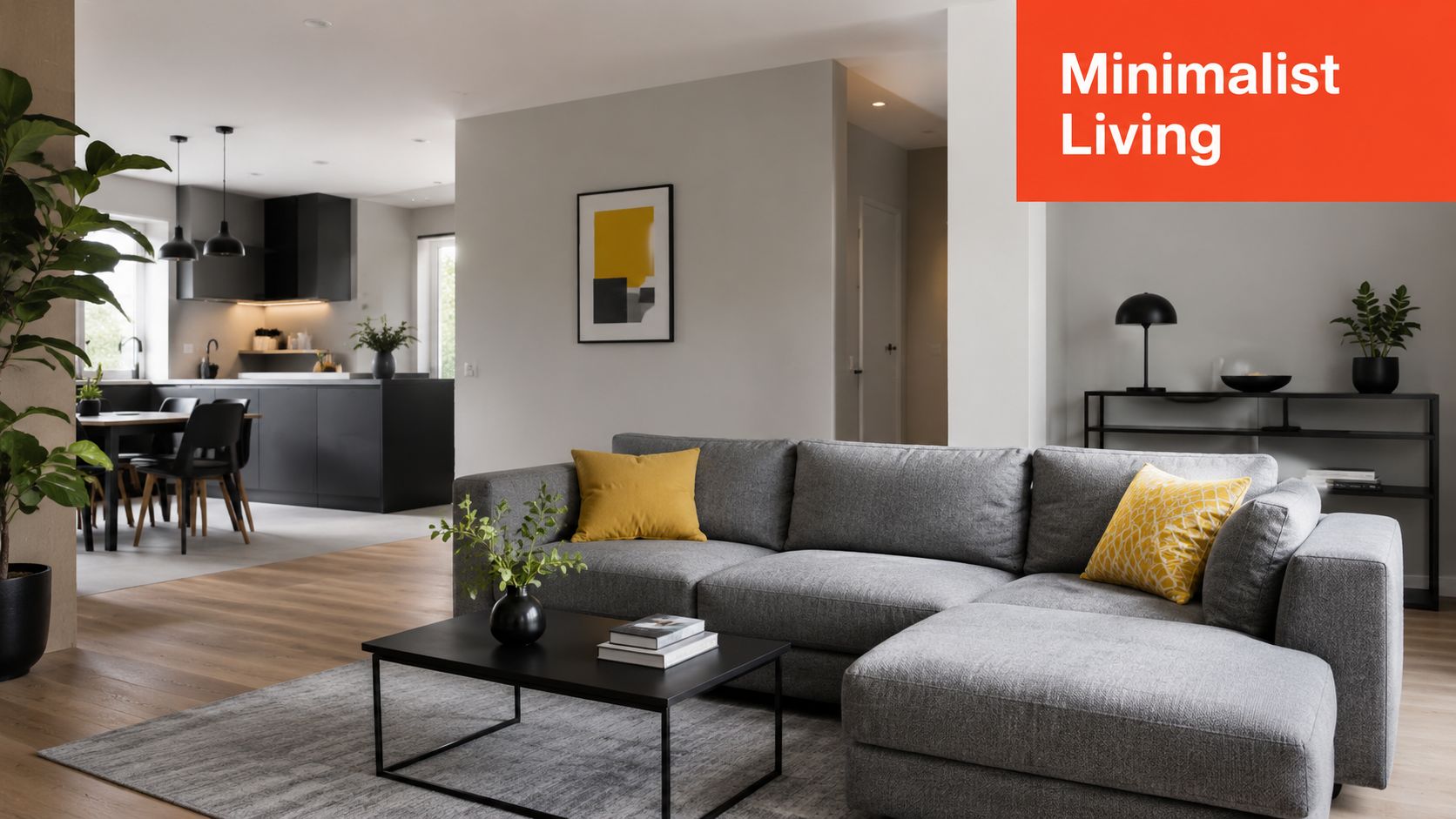
1. Modern Minimalist Grey and Yellow
Minimalism sells when it reads expensive, bright, and easy to move into. That makes this version useful in clean-lined condos, renovated colonials, and newer infill homes where buyers want order, not personality overload.
The formula is disciplined. Keep grey as the foundation. Use yellow to create one focal path through the room, usually from the first sightline to the seating area. That gives buyers a clear read on the space within seconds, which matters during short showings and fast-scroll listing searches.
What works in the field
Start with warm grey, not flat builder-grade grey. Warm grey keeps the room soft under mixed daylight and overhead bulbs. It also stops yellow from turning sharp or cheap on camera, which is a real risk in listing photos.
Keep the furniture profile low and the lines simple. A narrow-arm sofa, light oak or ash table, black metal lighting, and one controlled yellow note usually outperform a room loaded with themed accessories. If the living room is compact, skip the accent chair and put the color into art and a single pillow with some texture.
The trade-off is restraint. Too little yellow and the room disappears into the feed. Too much and buyers start reading the staging instead of the square footage.
Use these placement rules:
- Put yellow in the buyer's sightline: A framed print, lumbar pillow, or table lamp will register faster than floor-level decor.
- Repeat the color two or three times: That makes the palette look intentional and keeps one accent from feeling random.
- Protect negative space: Leave open surfaces on the coffee table, media unit, and walls so the room still feels minimal.
- Test the setup before install: Use before-and-after virtual staging previews to compare a safer version against a stronger one before ordering anything.
One more practical point. Minimalist grey and yellow can drift into mid-century styling fast, especially once walnut, tapered legs, or mustard velvet enter the room. Save those cues for the next look. If you need reference points for where that line starts, Canadian mid-century design insights are useful for spotting the furniture language buyers already associate with that style.
Practical rule: If the yellow is the first thing buyers mention, reduce it. If they describe the room as bright, calm, and updated, the mix is doing its job.
2. Mid-Century Modern Grey and Mustard
Mustard is where this palette starts making money instead of just filling space. It adds age, warmth, and a sense of curation. That matters in character homes, Eichler-inspired layouts, and urban properties with original windows, brick, or wood detail.
This look works because it connects nostalgia with current taste. Design coverage has consistently framed yellow as the lively focal color and grey as the balancing backdrop, and one source notes that most grey-and-yellow living room ideas are “innately modern” in their styling approach. For agents, that's useful. You can borrow a retro silhouette without making the room feel stuck in the past.
The right pieces to borrow
Go for tapered legs, walnut tones, low-slung seating, and geometric pattern used sparingly. A mustard velvet occasional chair can do real work here. So can a simple credenza and globe or brass lighting. Keep the walls and rug quieter than the furniture.
A Palm Springs-style cue fits this well, but so does a Toronto or Vancouver condo with good bones and little architectural personality. The furniture carries the story when the room itself doesn't.
Canadian mid-century design insights can help if you want to study the product language buyers already recognize, from walnut case goods to sculptural lounge seating.
Most agents style character homes too cautiously. Buyers who choose those homes usually want one room that feels collected, not generic.
The trade-off is obvious. Too much pattern makes the room look like a set. Too many vintage references make it feel costume-like. Use one geometric rug or two patterned cushions, not both plus loud art plus a starburst mirror. Grey should still control the perimeter so the room photographs cleanly.
3. Transitional Grey and Yellow Balance
Transitional staging sells because it lowers buyer resistance. It gives modern buyers a cleaner look without stripping out the comfort that family buyers and move-up sellers still expect. For agents, that makes it one of the safest grey-and-yellow directions for listings that need broad appeal and fast agreement.
The formula is disciplined. Keep grey on the expensive surfaces that are hard to change, sofa, rug, drapery, and larger case goods. Put yellow on the flexible layer, cushions, throws, art, and a single accent bench. If showing feedback says the room feels too warm, swap the yellow pieces in an afternoon instead of restaging the whole room.
Where this earns its keep
Use this in executive resales, newer suburban homes, and polished family properties where the buyer pool is wide. These buyers usually want a room that feels finished, calm, and easy to move into. Transitional styling does that well because it avoids the risk of reading too stark, too trendy, or too personal.
A good version usually includes upholstered grey seating, a wood coffee table with some visual weight, mixed-metal lighting, and one controlled pass of yellow through textiles or art. That balance matters in photos. Grey keeps the room orderly. Yellow creates recall once buyers have seen six similar listings in one afternoon.
The trade-off is simple. Too much symmetry and the room looks staged in the bad sense of the word. Too much yellow and it starts to read decorative instead of marketable.
- Build contrast inside the greys: light walls, a mid-tone sofa, and a deeper rug give the room shape without adding clutter.
- Keep yellow easy to replace: pillows, throws, and art do more sales work than a yellow sectional or painted feature wall.
- Use texture to carry the style: linen, brushed metal, warm wood, and soft weave fabrics keep the room from feeling flat.
- Test before you spend: AI photo editing tools for listing images let you trial a softer or stronger yellow accent package before ordering or moving a single item.
I use this approach when the room itself has no strong architectural identity. Transitional styling gives buyers a clear answer without forcing a strong taste profile on them. That usually means fewer objections, cleaner listing photos, and a better shot at holding price.
4. Industrial Grey with Citrine Yellow Accents
Industrial rooms are easy to overharden. Concrete-look walls, black metal, exposed brick, and warehouse lighting can photograph well but feel cold in person. Yellow fixes that, but only if it arrives as contrast, not decoration.
This is the right call for lofts, newer downtown apartments, and homes trying to attract a younger buyer pool without leaning childish. Citrine or strong marigold cuts through concrete and charcoal better than pale butter yellow. Weak yellow disappears against industrial finishes.
Keep the room from feeling like a lobby
Use softness aggressively. A flatwoven rug, boucle throw, oak or walnut tabletop, and warmer lamp temperature keep the space from reading commercial. If there's one yellow statement piece, make it substantial. A chair beats a vase. Art beats a candle.
One market signal matters here. The global living room furniture market was estimated at USD 231.8 billion in 2025 and projected to reach USD 339.6 billion by 2035, with growth tied to multifunctional, space-saving, and smart furniture adoption. That supports a clear staging decision. In industrial listings, buyers respond better to furniture that looks current and useful, not just stylish.
- Choose saturated accents: Citrine, mustard, and ochre hold their own against concrete and black steel.
- Use two or three yellow moments: One chair, one artwork, one side table is often enough.
- Refine the photos digitally first: You can test accent placement with AI photo editing workflows before bringing in physical pieces.
Industrial staging fails when every finish competes. Raw materials need one warm counterweight. Yellow is effective because it gives the eye a destination.
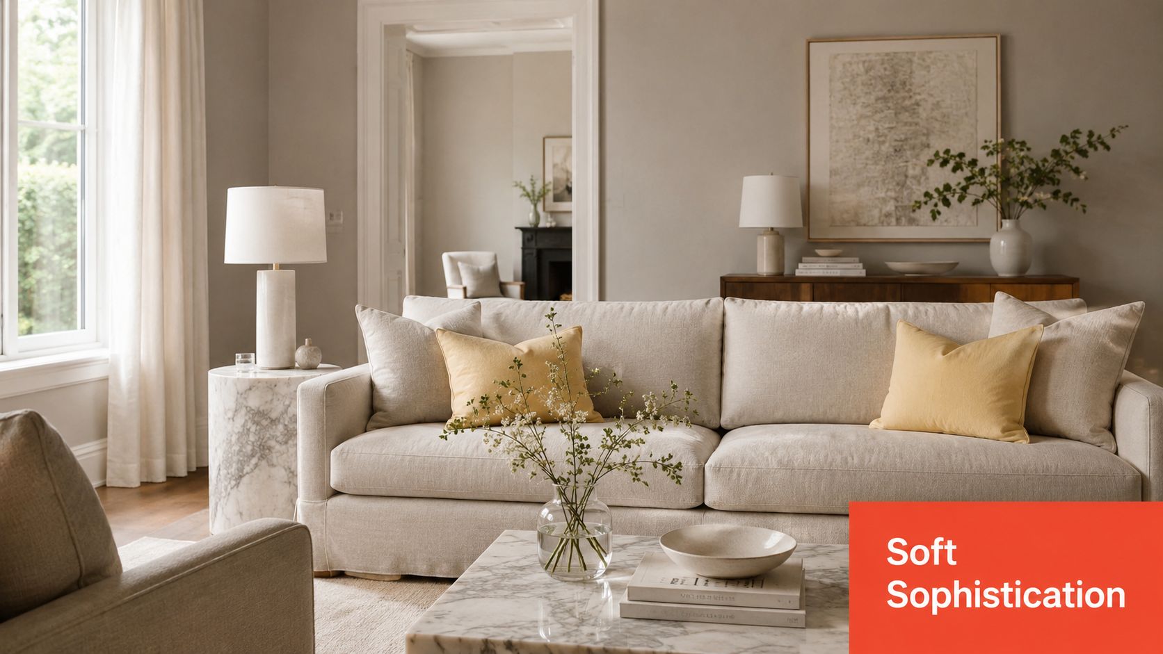
5. Soft Greige with Pale Yellow for an Upscale Look
This palette sells restraint, which is useful in listings where buyers are judging quality by small details. Greige carries more warmth than flat grey, and pale yellow brings light into the room without creating the sugary look that turns high-end spaces generic. In upper-tier condos, coastal properties, and newer builds with clean architecture, that balance helps the photos read calm, expensive, and finished.
Use pale yellow sparingly and place it where light can work for you. Art, glass, linen, a tonal pillow, or a restrained floral arrangement usually does enough. Large yellow walls rarely pay off here because they shift too much from morning to evening and can cheapen stone, brass, and cream upholstery in listing photos.
Why undertone control affects perceived value
Greige only works if the undertones stay consistent across the room. A pink-beige sofa, a green-greige wall, and a pale yellow accessory can drift out of sync fast, especially under mixed bulbs and window light. Buyers may not name the problem, but they read it as lower finish quality.
Lighting matters more in this style than in louder schemes. Pale yellow is sensitive. Under cool LEDs it can flatten out. Under overly warm bulbs it can look dingy. Set up layered lighting, then check the palette at different times of day before the photo shoot. If you are staging digitally, use a virtual staging guide for testing soft palettes before listing photography so the room stays consistent across hero images.
A strong setup is simple. Greige sofa. Ivory drapery. Travertine or marble side table. Pale yellow abstract art. One brushed brass lamp.
That combination works because it directs attention to material quality, not color novelty.
Natural texture does the heavy lifting here. Oak, limestone tones, boucle, matte ceramics, and quiet woven textiles give the room depth without adding clutter. This is one of the few grey-and-yellow approaches where fewer objects usually produce a higher perceived price point. Overstyling cuts directly against the goal.
6. Eclectic Bohemian Grey and Golden Yellow
This one works when the property needs personality more than polish. Think artist-owned homes, bungalows in creative neighborhoods, smaller spaces with awkward layouts, or rentals that need charm without renovation.
Start with one grounding element in grey. Usually that's the sofa or the rug. Then build outward with golden yellow through layered textiles, handmade ceramics, framed prints, and plant life. The key is repetition with variation. Not matchy-matchy. Collected.
Controlled eclectic beats chaos
This style attracts buyers emotionally, but it can also scare them if you overstyle it. Use a solid base, then layer pattern in controlled doses. One kilim-style rug, one block-print pillow, and one woven throw is usually enough. Add wood, rattan, and greenery to keep the room grounded.
The most overlooked variable here is light. In dim spaces, undertone matters. Guidance on yellow and grey living rooms notes that warm mustard or ochre reads cozier against mid-tone grey, while pale cool greys can make yellow accents feel sharper and smaller in underlit rooms, especially in north-facing or compact homes with lower natural light challenges. That's exactly why boho staging usually performs better with warmer greys than crisp icy ones.
If you want to test that mix before buying layered textiles, Bounti can help you preview virtual staging styles for different room personalities.
A quick visual reference helps when you're balancing pattern and warmth:
Use this look when the listing competes on vibe. Don't use it when the buyer pool expects clean luxury or corporate restraint.
7. Contemporary Monochromatic Grey with Yellow Pops
If the architecture is strong, this is often the most impactful choice. A monochromatic grey room with sharp yellow focal points can make even a simple boxy living room look curated. It's especially effective in new construction, modern apartments, and properties with large windows or open plans.
Grey should carry almost everything here. Walls, sofa, rug, drapery, and even some art can sit in different shades of grey. The yellow enters in a few strategic moves that direct attention. An accent chair near the window. A large artwork over the sofa. A sculptural object on a console.
Use yellow to direct the buyer's eye
This is less about decoration and more about choreography. Buyers don't look everywhere evenly. You can guide their attention with color placement. Put one yellow element near the strongest architectural feature and another farther back in the room to pull the eye through the space.
Gallery-like staging works because it feels intentional and calm. It also photographs well. But there's a line. Too many grey tones with no warmth can make the room feel sterile. Add texture through wool, linen, matte ceramic, and wood so the room doesn't flatten into one cold mass.
A good example is a downtown apartment with pale grey walls, charcoal sectional, silver-grey rug, black metal lamp, and one saturated yellow lounge chair. That chair becomes the memory hook. Buyers leave talking about the room instead of just the square footage.
The best accent in a grey yellow living room isn't the brightest object. It's the one placed where attention already wants to go.
7-Style Grey & Yellow Living Room Comparison
| Style | 🔄 Implementation complexity | ⚡ Resource requirements | 📊 Expected outcomes | Ideal use cases | ⭐ Key advantages | 💡 Tips |
|---|---|---|---|---|---|---|
| Modern Minimalist Grey and Yellow | Moderate, precise accent placement to avoid sterility | Low–Medium, neutral furnishings + a few curated yellow accents | Broad buyer appeal; photogenic; ~+3–5% perceived value | Modern/transitional homes, urban staging | Clean, versatile, easy to restage | Use 70% grey / 20% neutral / 10% yellow; warm grey undertones; place accents at eye level |
| Mid-Century Modern Grey and Mustard | Medium–High, needs period-appropriate silhouettes and pattern balance | Medium–High, authentic or high-quality repro furniture, brass/wood finishes | High engagement; appeals to design-conscious buyers; premium pricing potential | Mid-century homes, character properties, design-focused listings | Warm, nostalgic, Instagram-worthy | Source authentic/repro pieces; balance geometric patterns; add brass lighting |
| Transitional Grey and Yellow Balance | Low–Medium, mixing traditional and contemporary elements carefully | Medium, a mix of traditional and modern pieces, layered textures | Maximizes market appeal; faster offers; ~+10–15% market reach | Model homes, suburban/executive properties, broad-market listings | Broad appeal, professional, adaptable across buyer types | Layer multiple grey tones; use swap-able textiles; maintain ~70/25/5 grey/yellow/accents |
| Industrial Grey with Citrine Yellow Accents | High, confident execution needed to avoid feeling unfinished | Medium–High, industrial fixtures, raw materials, bold yellow statements | Distinctive impact; premium in urban markets; strong social media buzz | Lofts, converted warehouses, downtown apartments | Showcases architecture; dynamic photography; attracts young buyers | Use saturated citrine yellows; soften with rugs/throws; include 2–3 yellow statement pieces |
| Soft Greige with Pale Yellow Sophistication | Medium, subtlety and lighting critical for luxe feel | High, quality materials, high-end furnishings and finishes | Luxury appeal; justifies premium pricing (~+5–10%); timeless presentation | High-end coastal homes, luxury apartments, designer staging | Serene, timeless, photographs well in natural light | Invest in quality fabrics/finishes; keep accessories minimal but impactful; ensure excellent lighting |
| Eclectic Bohemian Grey and Golden Yellow | High, requires curated layering to avoid clutter | Medium, diverse textiles, global decor, layered accessories | Memorable, niche appeal; high engagement on social channels | Artist lofts, creative neighborhoods, small unique homes | Distinctive, personality-driven, strong visual depth | Repeat 3–4 pattern types; ground with a solid grey anchor piece; layer rugs → furniture → textiles |
| Contemporary Monochromatic Grey with Yellow Pops | High, bold, confident choices and tonal layering required | Medium–High, multiple grey tones plus high-quality yellow focal pieces | Gallery-like aesthetic; premium in design-forward markets; strong visual branding | Contemporary homes, minimalist apartments, high-end new builds | Sophisticated, strong focal points, highly photogenic | Use 2–3 bold yellow statements; layer 4–5 grey tones; position yellow to guide the eye |
From Plan to Listing Your Instant Staging Checklist
Choosing a grey yellow living room style is easy. Executing it with sales discipline is where most listings break down. Agents lose time shopping too broadly, matching accessories too precisely, or committing to furniture before they know how the room will photograph. The better approach is to test the visual direction first, then spend only where the concept proves itself.
Start with the shell. Check wall tone, flooring, natural light, and the room's strongest sightline from the entry. Then choose the staging angle that fits the property, not your personal taste. Modern minimalist works when the home needs clarity. Mid-century works when the architecture can handle character. Greige and pale yellow suit premium listings where texture matters more than color contrast.
The next step is practical. Declutter first. Correct the dominant grey undertone second. Add yellow last. That order prevents expensive mistakes. If you add bright accents before cleaning up the base, the room usually looks busy instead of intentional.
For agents who need speed, digital testing makes more sense than trial-and-error shopping. You can upload a walkthrough, try several staging directions, compare focal points, and create listing visuals without waiting on a traditional staging cycle. That's useful for occupied homes, remote sellers, and listings where the budget won't support full physical staging.
This also helps marketing. Once the room is restyled digitally, you can produce MLS-ready images, social posts, and before-and-after content that gives buyers a clearer reason to book a showing. If you need a practical starting point, maximize home value with staging by treating staging as a pricing and positioning tool, not just a decorating exercise.
Bounti Labs is one relevant option here. Bounti is designed for real estate workflows, including AI decluttering, virtual staging, restyling, and photo generation from a walkthrough. For a grey yellow living room, that means you can test several versions of the palette before making physical changes, then move into the market with stronger visuals and a tighter story.
If you want to turn a flat living room into a listing asset fast, try Bounti Labs. Upload a walkthrough, test grey-and-yellow staging directions, and create marketing-ready visuals that help buyers see the value before they ever step inside.