
You've got a listing that sits in the messy middle.
It isn't grand enough to sell on old-world charm alone. It isn't sleek enough to win the modernist crowd either. The kitchen has decent bones, the living room feels dated in photos, and the seller wants “something fresh” without replacing half the house.
That's where most listings stall. They don't have a design problem. They have a positioning problem.
For agents, transitional design solves that better than almost any other style because it helps a property feel current without alienating buyers who still want warmth, comfort, and familiarity. It's the visual equivalent of broad market appeal, but when it's done well, it doesn't read as bland. It reads as expensive, settled, and easy to move into.
I see this show up constantly in listing prep. A home looks too traditional when the furniture is heavy, the finishes are ornate, and every surface is full. Another home looks too cold when the staging strips out all softness and leaves only hard edges and white walls. Transitional design fixes both problems by editing the room, calming the palette, and giving buyers a version of the space they can imagine living in.
That's why before-and-after staging content performs so well for agents. Buyers respond fast when they can see a room shift from dated or cluttered to clean and aspirational. If you want a quick example of how visual repositioning changes perception, this house staging before-and-after guide shows exactly why presentation alters the story a listing tells.
The Secret to Listings That Everyone Loves
A common listing scenario goes like this. The house is well maintained, but nothing in it feels unified. The dining room is formal. The family room is casual. The fixtures lean old. The seller added a few trendy pieces that don't relate to anything else.
In person, buyers can sometimes forgive that. In listing photos, they usually don't.
Photos flatten nuance. They make visual conflict feel louder. Ornate trim looks heavier. Dark wood reads darker. Random decor choices feel more distracting. If the space doesn't resolve into a clear visual message, the listing loses momentum before a showing ever happens.
That's why transitional design works so well as a marketing strategy, not just a decorating style. It gives agents a way to reduce friction in how buyers read a room. Instead of forcing the property into a strict traditional or modern identity, it blends the best of both. The room feels familiar, but updated. Comfortable, but cleaner. Refined, but not intimidating.
Practical rule: If a buyer can describe a room as “nice, but not really my style,” the visual strategy probably isn't broad enough yet.
The strongest transitional listings usually share three outcomes:
- They widen appeal: Buyers who like classic homes don't feel pushed out, and buyers who want something current don't feel they're inheriting a time capsule.
- They photograph clearly: Neutral foundations, simpler silhouettes, and edited styling make the room read faster online.
- They support price perception: A cohesive interior often looks more move-in ready, even when the underlying finishes haven't changed.
That's the value. Transitional design helps a listing meet the market where the market already is.
What Is Transitional Design Really
Transitional design is best understood as a bridge style. It sits between traditional and contemporary, taking the comfort and familiarity of one and the cleaner lines of the other. For real estate marketing, that matters because buyers rarely sort homes into pure design categories. They respond to whether the space feels current, livable, and easy to personalize.
The style has roots in the 1950s, when it emerged as a response to the starkness of modern and mid-century modern aesthetics, and its mainstream acceptance became unmistakable in 2012, when the National Kitchen & Bath Association reported that transitional design had displaced traditional design as the most popular theme for the first time in its annual interior design style poll, as noted by Moss Building & Design's history of transitional design.
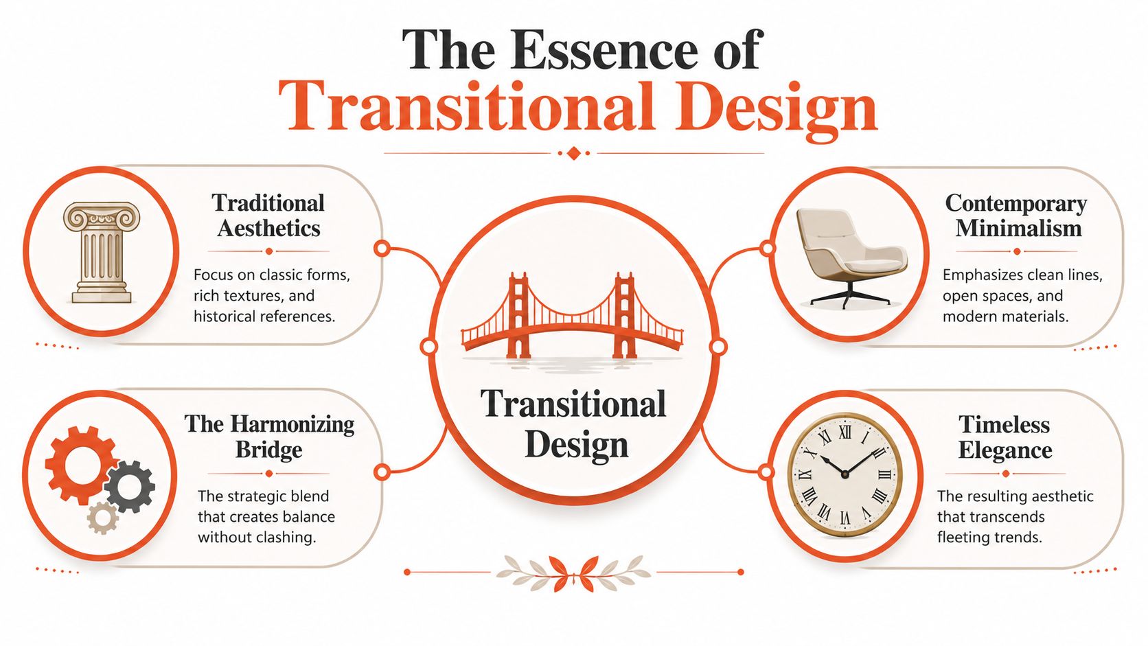
Why it isn't a fifty-fifty blend
A lot of agents hear “traditional plus modern” and assume the formula is equal parts both. That's usually where execution goes wrong.
Industry practitioners often describe fresh transitional design as closer to 40/60 or 25/75 rather than a strict split, with the contemporary side carrying slightly more visual weight, according to Dura Supreme's explanation of transitional styling. That's a useful working rule because it keeps a space from feeling stuck between eras.
If the room leans too traditional, it reads dated. If it leans too contemporary, it can feel cold or overly generic. The winning version keeps classic cues in the background and lets cleaner profiles lead.
A simple way to look at it:
| Design choice | What works | What doesn't |
|---|---|---|
| Furniture shape | Streamlined sofa with comfortable proportions | Bulky rolled arms and carved trim everywhere |
| Decorative detail | Minimal ornament, a few classic references | Competing formal details in every corner |
| Overall impression | Calm, current, timeless | Confused, theme-heavy, or sterile |
Why agents should care
This isn't design theory for its own sake. It's market positioning.
A transitional room tells buyers, “You won't need to undo much here.” That's powerful. Buyers can mentally move in faster when a space doesn't force them to accept a strong stylistic identity they may not share.
That flexibility is why the style adapts so well across listing categories. It can sit inside a downtown condo, a suburban family home, or a renovated older property without fighting the architecture. If you want a narrower variation of that idea, Slone Brothers' take on farmhouse transitional is useful because it shows how the same balanced approach can be tuned to a warmer, more casual read without losing polish.
Transitional design works when buyers notice the room, not the stylistic debate happening inside it.
Key Elements and Visual Cues
The easiest way to spot transitional design is to look for restraint. Not emptiness. Not minimalism. Restraint.
A transitional room usually feels organized before it feels decorated. The shapes are simpler. The palette is quieter. The materials do more of the work than the accessories.
According to Rocky Mountain Hardware's overview of transitional interior design, a core technical criterion is formal balance through symmetry, neutral-toned palettes, and functional layouts, with furniture and details defined by simple geometry and minimal surface decoration. For listing prep, that translates into a very practical checklist.
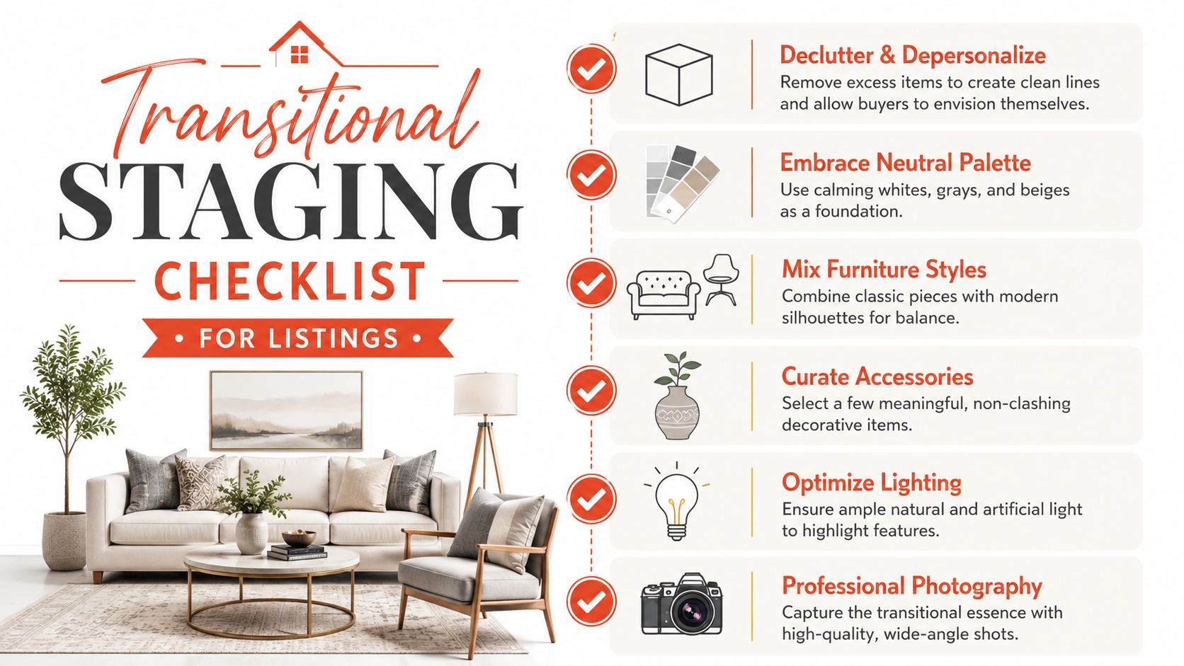
What to look for in the room
- A neutral foundation: Whites, taupes, creams, and warm grays usually anchor the space. This gives photos a cleaner read and lets architectural features stand out.
- Clean-lined seating: Sofas and chairs should look comfortable, but not overstuffed or ornate.
- Texture instead of clutter: Wood, linen, metal, glass, and woven materials add depth without introducing visual noise.
- Limited accessories: Fewer objects, chosen more carefully. One oversized vase beats six small knickknacks.
- Symmetry where possible: Matching lamps, balanced nightstands, or a centered art arrangement create stability in photos.
What usually hurts the look
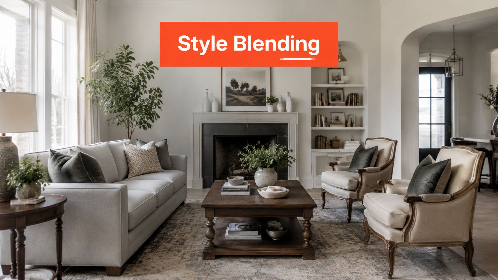
The fastest way to break transitional design is to mix too many signals at once.
A tufted traditional sofa, industrial bar stools, glam lighting, rustic wall decor, and abstract minimal art can all be good pieces on their own. Together, they often make the room feel undecided. Transitional design isn't a license to combine everything. It's a discipline of controlled blending.
Here's a useful visual reference before you make staging decisions.
Commercial spaces need different cues
Agents often apply residential styling logic to office suites, model units, or mixed-use interiors. That usually weakens the result.
In commercial settings, transitional design still relies on simple geometry and material balance, but the accessories should work harder and say less. Artwork becomes more important because it can warm a clean environment without adding clutter. If you're styling a workspace, it helps to explore art for office walls that supports a polished, neutral scheme rather than turning the room into a themed set.
The room should feel finished, not decorated to death.
Staging and Photographing for Listings
Staging for transitional design isn't about making the home look trendy. It's about making the home look easy to buy.
That's a different goal. Trend-driven staging can get attention, but broad-market staging gets more buyers through the funnel. Transitional design excels here because it helps people see possibility without making the property feel empty or anonymous.
Most design articles stop at “use neutrals” and “mix old and new.” That's not enough for listing work. As noted in this piece on the gap in transitional design advice, most guides don't explain how transitional staging should differ for condos, luxury listings, or commercial suites, even though the challenge is turning that versatility into photo-ready visuals for specific buyer segments.
Match the style to the property type
A condo needs a different transitional read than a suburban family home.
| Property type | Transitional staging priority | Common mistake |
|---|---|---|
| Urban condo | Light palette, cleaner edges, fewer pieces | Overfilling small rooms with “cozy” furniture |
| Suburban family home | Warm textures, practical layout, approachable polish | Making the house feel too formal |
| Luxury listing | Stronger material contrast, larger-scale art, tighter editing | Using safe neutral staging that erases distinction |
| Commercial suite | Functional zoning, minimal accessories, crisp lines | Styling it like a living room |
In condos, every piece should protect the sense of space. In larger homes, the goal is usually the opposite. You need enough weight and texture to keep big rooms from feeling flat on camera.
Photograph what the style is doing
A transitional room succeeds in photos when the camera captures balance, not just furniture.
That means agents and photographers should pay attention to these details:
- Show symmetry when it exists: Straight-on compositions can make paired lamps, centered beds, and balanced built-ins work harder.
- Let texture catch light: Linen drapes, matte wood, brushed metal, and soft upholstery create depth that keeps neutral rooms from looking dull.
- Edit surface styling for the lens: A coffee table can hold a tray, a book, and one object. More than that usually starts reading as clutter.
- Keep pathways visible: Buyers need to understand flow instantly from the gallery view.
Buyers don't reward effort. They respond to clarity.
If the home is vacant, cluttered, or caught between styles, virtual work is often the fastest route to consistency. A solid virtual staging guide for agents can help you decide when digital staging is the better move, especially when timing, budget, or seller cooperation is limited.
Don't let “broad appeal” become bland
This is the trade-off agents miss most.
Transitional design should widen appeal, but it still needs one or two points of identity. That could be a sculptural light fixture, a strong area rug, oversized art, or a standout dining table. Without that anchor, the listing can feel polished but forgettable.
The right question isn't “Does this offend anyone?” It's “Would a buyer remember this room tomorrow?”
How to Achieve the Look on a Budget
Most sellers don't need a full redesign. They need the room to stop fighting itself.
That's good news, because transitional design is one of the easiest styles to fake well on a modest budget if you focus on the right visual levers. The biggest wins usually come from subtraction, simplification, and a few strategic swaps.
Start with the changes buyers notice first
Paint matters. So does visual noise.
If the walls are dark, yellowed, or highly specific, a neutral repaint often does more for transitional design than new furniture ever will. The goal isn't to make the home look empty. It's to create a quieter backdrop so the room's shape and light come forward.
After that, decluttering does the heavy lifting. Remove extra side tables, excess decor, oversized recliners, and anything that interrupts the room's lines. Transitional spaces need breathing room.
Small upgrades with strong return
Here are the budget moves I'd prioritize before recommending expensive purchases:
- Swap dated hardware: Cabinet pulls, vanity hardware, and door handles with simpler profiles instantly reduce visual age.
- Replace loud light fixtures: You don't need statement chandeliers everywhere. Clean fixtures with restrained lines usually work better.
- Use slipcovers or reupholstered accents: If the sofa shape is acceptable but the fabric is busy or worn, simplify the surface first.
- Bring in textiles carefully: One textured throw, a few well-scaled pillows, and a quiet rug can soften a room without cluttering it.
- Edit window treatments: Heavy valances and ornate drapery often drag the room backward.
Know what not to spend on
Don't waste a staging budget trying to create a perfect showroom.
If the listing needs help, focus on what changes the photos fastest. Buyers usually respond more to clean lines, lighter surfaces, and better editing than to expensive decorative details. An affordable chair with the right silhouette helps more than a costly ornate piece that pulls the room off course.
A simple decision filter works well here:
| Budget item | Usually worth it | Usually skip it |
|---|---|---|
| Paint | Yes | Rarely skip if color is hurting photos |
| Decluttering help | Yes | Not optional in crowded homes |
| New accessories | Sometimes | Skip if core furniture is still wrong |
| Full furniture replacement | Selectively | Skip unless current pieces are badly dated |
Budget staging works when every dollar removes friction from the buyer's first impression.
Instantly Market with AI-Powered Transitional Design
Agents already know the manual version of this process. Walk the property. Identify what's hurting the visuals. Remove clutter. Rearrange furniture. Borrow or rent pieces. Schedule staging. Wait for photography. Hope the seller doesn't change the room before showings.
That workflow can still work. It's just slow.
AI changes the speed of execution. Instead of physically rebuilding every room, agents can now generate listing-ready transitional visuals from existing spaces, including rooms that are empty, cluttered, outdated, or visually inconsistent. For teams handling multiple listings, that matters because transitional design is often most valuable at the exact moment when time is shortest.

Where AI fits best
AI is especially useful when the goal is visual repositioning, not construction documentation.
That includes:
- Vacant rooms that need warmth and scale
- Occupied homes where existing furniture blocks broad appeal
- Dated interiors that need a cleaner, more marketable style direction
- Commercial spaces where different layout moods need to be shown quickly
The strategic advantage isn't just speed. It's control. You can test a softer transitional look for one audience and a sharper, more contemporary-leaning version for another without moving a single chair.
What good AI visuals should do
A strong AI-generated transitional image shouldn't feel flashy. It should feel plausible.
That means the best outputs preserve the room's proportions, respect the architecture, and apply the style with restraint. If the generated design introduces too much drama, too many accessories, or furniture that couldn't realistically fit, the image stops helping the listing and starts raising objections.
For agents comparing tools or trying to sharpen prompts, resources on creating stunning interior designs can be useful for understanding how design visualization tools approach style generation. And if your focus is the image pipeline itself, this guide to the best AI photo editing software is a practical reference point for evaluating what belongs in your workflow.
The shift is operational. Transitional design used to require more coordination than many listings could support. Now agents can produce the look quickly enough to use it where it has the most impact, at the exact point where buyer attention is won or lost.
Bounti Labs helps agents turn that strategy into actual listing assets. With Bounti Labs, you can start with a single video walkthrough and generate property descriptions, stills, MLS-ready photos, and AI-powered decluttering, staging, restyling, or renovation visuals that make any space look its best. If you want transitional design to move from concept to market-ready execution without the usual delays, Bounti is built for that.